The ultimate guide to CSS frameworks in 2026
blogDetail.updated September 22, 2026



blogDetail.subscribeCard.title
blogDetail.subscribeCard.description
Writing CSS from scratch can be a tricky and time-consuming process, especially if you're working in a development team fulfilling multiple roles or working as a full-stack developer. It can be frustrating when your workflow gets interrupted and you have to switch context to deal with a difficult layout issue or some unexpected behavior.
That's why CSS frameworks are important: Not only do they improve efficiency and scalability, but they also help keep your design consistent. The right CSS framework can save lots of development time, and in 2026, the number of frameworks to choose from is bigger than ever.
In this post, we explore the top CSS frameworks of 2026, looking at their unique features and ideal use cases.
What are CSS frameworks?
CSS frameworks are pre-prepared libraries of CSS stylesheets, which often include scripting languages like JavaScript or Sass to support them with things like interactivity and maintainability. They simplify UI development by providing you with prebuilt styles and components, and they're generally tested across major browsers, reducing styling issues across platforms. They include standardized styles for elements such as buttons, typography, and grid systems, which make responsive layouts easier to build. As the stylesheets are already set up, all you have to do is consult the documentation and use the correct classes, IDs, or components to style your website.
By using these frameworks, you eliminate the need to write all of your CSS from scratch. This saves time and, if used correctly, ensures consistency and quality across your project. Say goodbye to putting !important all over your stylesheet just to center some text.
The key components of a CSS framework
CSS frameworks differ in terms of style philosophy, layout systems, and the level of customization and control they offer. However, they tend to comprise the following key components:
Grid system
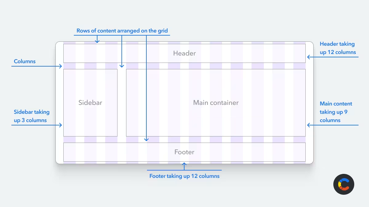
To help you structure the layout of your website, most CSS frameworks have a grid system. A grid system divides the page into columns and rows to simplify the alignment and positioning of your content and define how the page should break down on window resize, so it's essential for responsive design.
Predefined styles
CSS frameworks provide prebuilt styling for common UI elements, such as buttons, forms, text elements, navigation bars, modals, and more. You can consider these styles a base level that gives you a consistent foundation from which to introduce your own styling if needed. This saves time and effort, especially during rapid prototyping when you just need to quickly demonstrate a design.
Responsive design features
Most CSS frameworks have a mobile-first approach: prioritizing the design and development of apps for mobile first and expanding from there. This includes automatic optimization for different screen sizes. Under the hood, the framework uses media queries to target different screen-size breakpoints for device-specific styling.
Utility classes
Some CSS frameworks provide you with utility classes, which are just shortcuts for common CSS properties. These allow you to apply styles quickly without custom CSS. For example, in the CSS framework Tailwind, you can use a utility class like bg-green-500 to change the background color to green. You can also use the p-4 class, which adds 16px (1rem) of padding by default (you can customize this value by changing the --spacing variable in your CSS using Talwind’s @theme directive):
Theming and customization
Most CSS frameworks allow you to apply theming and customization to the existing styles. This enables you to customize colors, typography, and spacing via variables. This added customization allows you to match your project or company's branding. Some CSS frameworks support the use of Sass or Less for variables and mixins to apply modular styles, making your code easier to reuse across larger projects.
Accessibility features
Semantic HTML means using elements for what they represent (for example, <button> for actions or <nav> for navigation) so that browsers, screen readers, and search engines all interpret the page in the same way. How much a framework helps with this depends on its architecture. Component-based frameworks have the correct output built in. For instance, if you render a <Button/> component, you get a real HTML <button>. Class-based and utility-based frameworks don't make that decision for you. You could style a <div> to look like a <button>, and the framework wouldn't stop you, so the responsibility to enforce semantic HTML falls to you.
Some CSS frameworks provide ARIA attributes to add extra context to interactive elements for users using screen readers. They may also provide focus management and keyboard navigation, which are needed for users who don't use a mouse when interacting with non-standard elements like custom modals, drop-downs, or carousels.
JavaScript components
Some CSS frameworks have JavaScript built in for interactivity in UI components like modals, tooltips, drop-downs, and carousels. This can save developers lots of time because they don't need to implement custom scripts for complex interactivity and animation.
The top 7 CSS frameworks in 2026
The ideal framework will depend on your preferred design approach, customization needs, and developers' experience level, among other factors. Fortunately, there is a wide range of CSS frameworks to choose from.
The following seven frameworks are the top choices of 2026. Each has its own set of strengths and is best suited to different use cases.
1. Bootstrap
Bootstrap, released in 2011, remains the most widely deployed CSS framework in the world. With its focus on responsive design, it introduced the first widely adopted grid system. It's an intuitive and long-standing framework used by major companies like Spotify and LinkedIn. The following are some of its key features:
Grid system: Bootstrap has an intuitive grid system layout that uses six responsive breakpoints, allowing you to control how your pages break down across screen sizes.
Extensive component library: It gives you an extensive library of prebuilt components for different needs, which you can access through different class names, such as
btnorcontainer. This component-based design makes it beginner-friendly.Huge ecosystem: It offers a huge array of different themes, templates, and plugins for developers and designers to choose from, along with well-established community support to help if you get stuck on something.
Built-in JavaScript: Bootstrap comes with built-in JavaScript for interactive components such as modals and carousels, which saves time when building interactive UI.
Great documentation: Bootstrap has clear and well-defined documentation, which makes it easier to learn and provides something helpful to consult if you run into any problems.
Popularity: 175k GitHub stars / 6,359,308 weekly npm downloads.
One pitfall with using Bootstrap is that many websites end up looking the same because it's so popular and many people just use the default components. Another thing to be aware of is Bootstrap's size; it's quite large and can impact performance if you use the full framework. It is possible to optimize performance by customizing builds, but that requires more configuration.
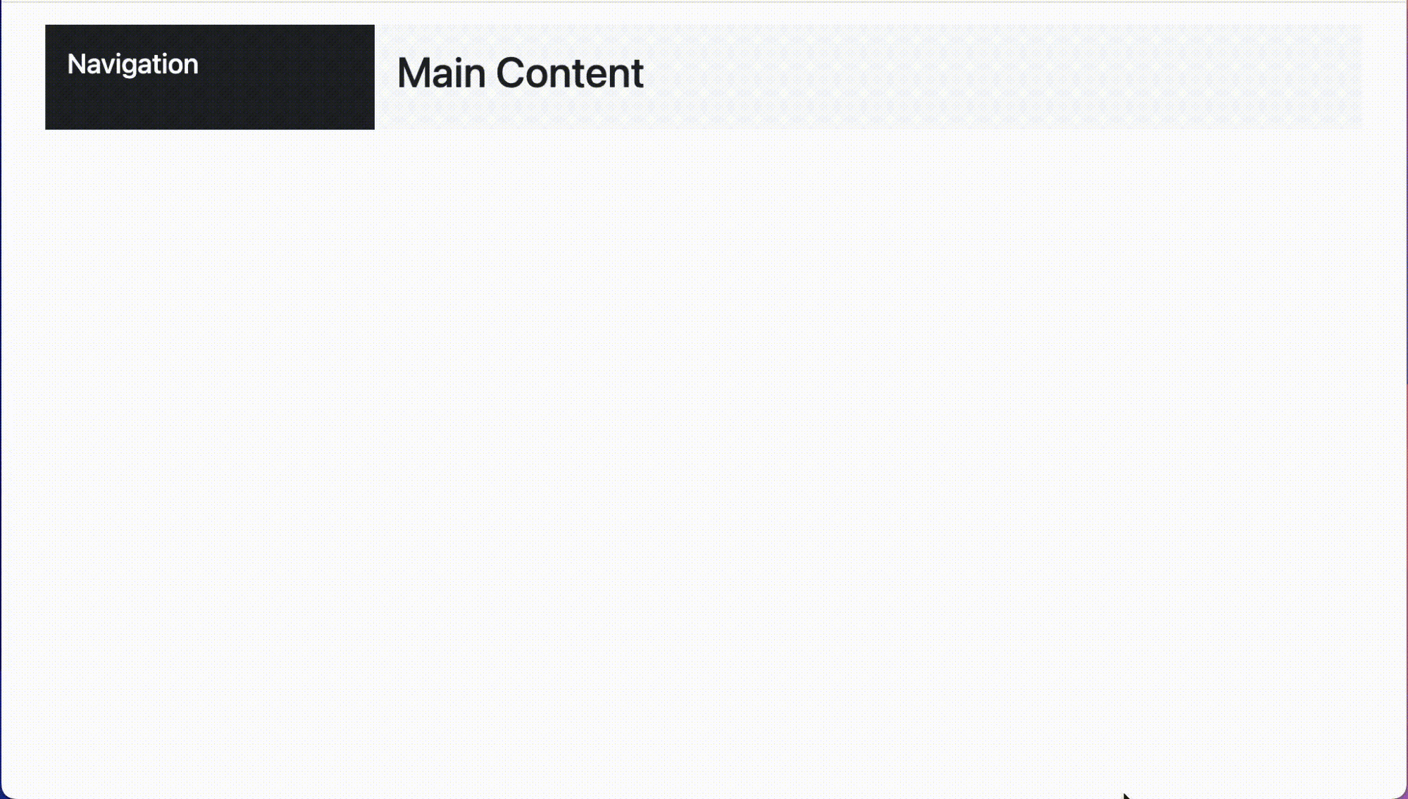
How to use Bootstrap: The example below shows how to place content within the grid system, which will reposition on window resize:
2. Tailwind CSS
Tailwind CSS was the most used CSS framework in 2026. Its newest engine, Tailwind CSS v4, runs builds up to five times faster than v3. It employs a utility-first approach that gives you more control and customization. Tailwind CSS comes with the latest CSS features in easy-to-use utility classes, which you can apply directly in your components, eliminating the need for stylesheets.
Tailwind is also highly adaptable and can be used with most JavaScript frameworks. It pairs well with component libraries like daisyUI and Flowbite, which add semantic classes like btn and card on top of the utility layer. Tailwind is popular with experienced developers and has a high retention rate, signaling its quality. The following are some of its standout features:
Utility classes: Using utility classes is more time-consuming but allows for full control and flexibility.
Minimal custom CSS: Tailwind reduces the need for custom CSS, as styling is applied to the HTML itself, and utility classes are granular.
Just-in-time (JIT) compilation: Tailwind uses JIT to generate only the styles your project uses, which, in turn, improves performance.
Lightweight: Tailwind can reduce your project's CSS size. Thanks to the JIT compiler removing any unused styles, it's rare to end up with more than 10 KB of compressed CSS, regardless of project size.
CSS only: It doesn't include any JavaScript for interactive components, but you can pair it with most JavaScript frameworks to add these features. Tailwind also provides CSS transitions and animations out of the box.
Popularity: 96.2k GitHub stars / 36,209,796 weekly npm downloads.
How to use Tailwind: The following code makes a flexbox, then centers it horizontally with justify-center. The button inside the flexbox has classes that add some color to its background and text and add padding.
3. Chakra UI
Instead of component or utility classes, Chakra UI provides developers with prebuilt React components (which makes it a React component library). It uses React properties (props) that you can pass through to these components to configure their behavior and style — for example, the props colorPalette and size, which are shown below:
Here are some of its standout features:
Component library: Chakra UI offers a comprehensive library of prebuilt components (including a SimpleGrid component for grid-based layouts) that are customizable and allow you to move quickly to develop the UI.
ARIA compliant: All components are designed to be fully accessible out of the box, offering full support for keyboard navigation and screen reader use. This helps you create inclusive applications accessible to all users.
Ease of theming: Chakra UI supports light and dark mode, and, as it's using CSS-in-JS under the hood, it makes it easy to change styles dynamically at runtime (e.g., changing from light to dark mode dynamically). It's also easy to customize themes to apply your own styling for brand consistency.
Popularity: 40.6k GitHub stars / 1,504,090 weekly npm downloads.
How to use Chakra UI: Here's an example to show how you might center a button. To get this example up and running, you'll need to start a new React project and install Chakra UI and @emotion/react, then wrap the app in <ChakraProvider value={defaultSystem}>:
4. Foundation
Foundation is an open-source, responsive CSS framework providing a set of pre-styled, customizable (with Sass) utility classes that can be used to create layouts for websites (Foundation for Sites) or emails (Foundation for Emails). It also provides UI templates and "building blocks" to help you get started on your designs as quickly as possible. Here are some of its standout features:
Two different grid types: Flex Grid (built on Flexbox for simple alignment and equal-height columns), which is similar to Bootstrap, and CSS Grid (for advanced layouts with precise row and column control).
Accessibility: With Foundation, accessibility is built in. All code snippets come with ARIA attributes, ensuring your users have a good experience regardless of ability or device.
Modular design: Foundation is modular by default. This allows you to divide your codebase into self-contained components, resulting in a tidier and more maintainable codebase.
Responsive design: Foundation was the first responsive framework, so this comes built in. It offers a set of advanced media queries that cover a wide array of devices.
Animation library: Foundation uses Motion UI, a Sass-based library of CSS transitions and animations that used to be included with Foundation but has since been turned into its own separate package. You can import it and use it on various components to add animation and transitions.
Responsive typography: It provides a module to automatically adjust text sizes based on screen width.
Visibility classes: You can control element visibility across devices, which is useful when you might want to hide an element on specific devices with different widths.
Popularity: 29.8k GitHub stars / 110,774 weekly npm downloads.
How to use Foundation: Foundation's Sass-based build (v6.9.0) requires Node.js 18+ if you're compiling from source rather than loading from the CDN.
5. Bulma
Bulma is an open-source CSS framework based on Flexbox (but built with Sass). It's 100% responsive and customizable, and it offers a range of different components that you can access through its utility classes, resulting in minimal CSS coding. Here are some of its standout features:
Rich library of components: Bulma provides a big library of different components to choose from, including tables, forms, modals, and navbars.
Lightweight: Its modular structure lets you import only what you need; for instance, you may only need the grid system for layouts or just a few buttons. The ability to import only what is needed keeps the CSS file size minimal.
CSS only: It doesn't include any JavaScript for interactive components. That said, you can pair it with any JS framework, and there are extensions that provide interactive elements.
Highly customizable: Bulma allows for customization, and you can easily extend it with Sass variables, mixins, or custom classes.
Popularity: 50.1k GitHub stars / 400,862 weekly npm downloads.
How to use Bulma:
6. Materialize
Materialize is a CSS framework (now maintained as a community fork) built on Google's Material Design principles, giving it a visually appealing and consistent UI. It focuses on card-based layouts, bold colors, meaningful shadows, and animations that mimic real-world interactions. Here are some of its standout features:
Easy to use: It provides ready-to-use components with CSS classes that are straightforward to implement.
Responsive and customizable: It comes with a flexible grid system, making it easy to create layouts that work on multiple screen sizes.
Built-in animations and transitions: It includes predefined animations (e.g., ripple effects for buttons) and smooth transitions to mimic real-world interactions.
Built-in JavaScript components: Materialize provides some built-in JavaScript components, such as tooltips, drop-downs, and modals, that have interactivity out of the box, allowing you to create visually appealing transitions in less time.
Popularity: 987 GitHub stars / 3,954 weekly npm downloads.
How to use Materialize:
7. UIkit
UIkit is a modular CSS framework that focuses on simplicity and is designed to help you build lightweight and fast front ends with minimal effort. It provides a set of components that you can access through CSS utility classes. Here are some of its standout features:
Modularity: Include only the components you need (e.g., grid, buttons, modals) rather than the entire framework. This makes it lightweight, meaning a smaller file size and a faster website for you.
Advanced grid system: UIkit supports Flexbox and CSS Grid to give you advanced features such as masonry layouts and parallax effects out of the box.
Built-in JavaScript components: It has a set of JavaScript components (e.g., modals and sliders), so you don't need any extra libraries for interactivity.
Popularity: 18.4k GitHub stars / 20,904 weekly npm downloads.
How to use UIkit:
A comparison of the top 7 CSS frameworks of 2026
Generally, beginners prefer a framework that offers a decent aesthetic quality for its predefined components out of the box: The less customization required, the better. They also tend to gravitate toward frameworks with bigger communities and clear and comprehensive documentation.
Out of the seven top frameworks we have mentioned, Bootstrap and Bulma are most suited to beginners due to their pre-styled components, easy-to-read documentation, and supportive communities.
If customization is more important to you, then Tailwind CSS might be a better option. This is because it provides the most granular control with its utility classes, allowing you to access CSS properties. It also gives you the option to use only what you need.
Foundation is a solid choice for enterprise-level applications, offering advanced responsive design for complex layouts and modular components for scalability.
The following table provides an overview of where each framework excels, for comparison:
Framework | Use case | Features | Performance | Theming | Layout options |
|---|---|---|---|---|---|
Bootstrap | Best suited to beginners and people looking to prototype | Offers prebuilt components and a good grid system | Medium: Quite heavy unless optimized for performance | Customizable (Sass) | Flexbox |
Bulma | Best suited to simple and lightweight projects | Offers Flexbox grid and minimal JavaScript (better for performance) | Fast: Lightweight with no JavaScript components | Customizable (Sass) | Flexbox |
Tailwind CSS | Good for projects that need a lot of customization or specific branding | Utility-first design, responsive CSS, and customization | Fast: Optimized for performance (use only what you need with JIT compiler) | Highly customizable | Flexbox and CSS Grid |
Foundation | A good choice for enterprise apps that need scalability and a mobile-first approach | Responsive typography; great grid system | Medium: Optimized for large projects | Customizable (Sass) | Flexbox and CSS Grid |
Chakra UI | Useful if you're building a React app already and want the ability to switch to dark mode at runtime | Accessible components and built-in theming | Slower: CSS-in-JS and React components | Highly customizable (and allows for on-the-fly switching between dark and light mode) | Flexbox and CSS Grid |
Materialize | Great if you want to follow Google's Material Design principles | Material Design components, responsive CSS, and mobile-first design | Slower: Heavier than utility-based frameworks due to JavaScript components but still optimized for performance | Only basic theming support | Flexbox |
UIkit | Good if you want a balance between the flexibility and speed of Tailwind CSS and the ease of use of more modular frameworks like Bootstrap | A range of customizable components and a clean design | Medium: Comes with JavaScript components; while not as light as utility-based frameworks, it's better optimized than Bootstrap/Materialize | Customizable with Less | Flexbox and CSS Grid |
Advantages of using a CSS framework
The advantages of using a CSS framework are numerous. It takes the time-consuming activity of writing CSS from scratch and replaces it with quick and easy utility classes or prebuilt components that you can customize. Here are some of the main benefits of using a CSS framework:
Faster development process: Having a set of predefined components as a baseline from which you can build allows you to avoid reinventing the wheel, as components such as navbars and buttons are well established. Using something prebuilt and customizing from there greatly speeds up development.
Consistent design across projects: Employing a CSS framework will give you a consistent design across your different projects, as styles are standardized. You can import configuration files for theming, easily making sure your projects follow branding requirements.
Responsive layouts out of the box: All CSS frameworks have some sort of grid system: either a traditional row-and-column setup like Bootstrap or utility classes that allow you to build your own grid. This makes it simple to design webpages that work for different screen widths.
Community support and documentation: All of the major CSS frameworks have strong community support ready to lend a helping hand if you run into difficulties. Most also have clear and intuitive documentation, making them easy to use.
How to choose the right CSS framework
Not all frameworks are equally suited to specific use cases. Here are several factors to consider when deciding on the right CSS framework.
Component-based vs. utility-first
There are generally two main approaches to how CSS frameworks package styling for you to work with. Component-based frameworks provide pre-styled, ready-made components or classes, which give you UI elements such as modals, buttons, or cards. You can then drop these components or classes into your code and get a fully styled element without having to write custom CSS. Component-based frameworks get you results quickly, but you're trading off granular control, as you're building on top of someone else's design decisions. Different component-based frameworks have distinct styles and differing levels of customization available.
Utility-based frameworks give you single-purpose classes that map to CSS properties, which you then compose together to build a design from scratch. This gives you the granular control that component-based frameworks lack, at the cost of a steeper learning curve and more verbose HTML. The utility-first approach solves the scaling issue with hand-written CSS: There are no naming conventions to invent, styles are safe to delete with the markup that uses them, and spacing/color values stay consistent by pulling from a fixed set.
Project size
If you're working on a small project, then a framework such as Bulma, which is lightweight and fast with fewer features, may be better suited to you. Larger, more commercial projects need something more robust with many features, so frameworks like Bootstrap or Foundation might be a better fit.
Customization needs
If customization is the top priority in your project, then Tailwind is the top choice for full control over customization. For out-of-the-box, pre-designed components, go with Bootstrap or Materialize. It's also worth considering your team's experience with CSS. Those more familiar with it might prefer something like Tailwind, giving them more control, whereas beginners will probably prefer something that provides as much out of the box as possible, like Bootstrap.
Rapid prototyping
If the main priority is getting a working demo in front of stakeholders quickly, then component-based frameworks have the edge with rapid prototyping. Bootstrap, Bulma, and Materialize all provide complete, pre-styled components (e.g., navbars, modals, cards) so that you can quickly assemble a UI without having to worry about custom CSS.
Project type
Tailwind suits content-heavy sites, as it provides granular control over typography, spacing, and responsiveness. This makes it ideal for websites like blogs. Bootstrap suits corporate websites and prototypes, as it provides clean, professional-looking components out of the box. It also has a big community and is popular, helping with maintainability. Foundation is best used to deliver enterprise-level applications, as it provides advanced responsiveness for complex layouts and is highly customizable.
Performance
Tailwind CSS is great for performance because of its utility-first design; its JIT compiler only compiles the styles you need and nothing more. UIkit also allows you to load only the components you're using, resulting in better performance overall.
Browser compatibility
With IE11 now retired and its usage negligible, most browser compatibility issues come from newer CSS features (such as container queries, :has(), and CSS nesting) being made available for developers to use in Chrome and Edge before other browsers like Firefox and Safari have a chance to modernize and catch up.
Most major frameworks provide a supported browser matrix and have fallbacks to older syntax rather than relying wholly on new features. If browser compatibility with older browsers is a priority, check the framework's compatibility matrix first to ensure it's covered.
Emerging trends in CSS frameworks
The emerging trend seems to be toward increased adoption of utility-first frameworks (like Tailwind), with a push toward modularity and performance. Another popular trend is zero-runtime CSS: Chakra UI, mentioned above, is one of many frameworks that allow for dynamic runtime styling. AI-assisted and low-code styling is also on the rise with platforms like v0 by Vercel. Native CSS features may also replace frameworks for some use cases as CSS becomes more capable. (CSS Grid is a good example of an improvement like this.)
Utility classes gave developers granular control with the scaling issues of CSS solved, but they came with a slight setback: A single button may carry 10 classes depending on how you've styled it, which can be difficult to read when surrounded by similar components. daisyUI and Flowbite are part of a trend to solve this problem, giving you component classes for common patterns on top of Tailwind CSS (like ```btn btn-primary). This allows you to drop down to individual utility classes when needed.
Other trends include a pull toward better accessibility and user preferences (e.g., offering dark mode as standard).
CSS frameworks + Contentful for faster development
CSS frameworks provide you with a way to speed up your development pipeline by delegating basic styles, interactivity, and complex layout requirements so that you can focus on other priorities, like business logic or API integrations.
Another tool that helps speed up your development is Contentful, which you can use to manage your content straight out of the box with no server or database setup required. You just create your content model in the Contentful dashboard and then fetch it through the Contentful REST or GraphQL APIs. Non-developers can update content in the dashboard, and changes will immediately sync, updating the content on your website.
Another way Contentful can save you time is by helping to speed up UI development. We created Forma 36, a React UI library that provides you with a comprehensive set of highly customizable, prebuilt components, allowing you to create consistent user interfaces for your pages that interact with Contentful.

blogDetail.subscribeCard.title
blogDetail.subscribeCard.description
blogDetail.authors

David Fateh is a software engineer with a penchant for web development. He helped build the Contentful App Framework and now works with developers that want to take advantage of it.

Bulent collaborates with Contentful's customers, partners and users to publish articles that support and elevate the community.
blogDetail.relatedArticles

What is vibe coding? Moving fast (and not breaking things) with AI assistance
February 3, 2026
Next.js vs. React: The difference and which framework to choose
February 4, 2025
GitLab vs. GitHub: How are they different?
June 11, 2025

Ready to start building?
Put everything you learned into action. Create and publish your content with Contentful — no credit card required.