10 principles to building interfaces users will love
Published on March 5, 2019


Inspiration for your inbox
Subscribe and stay up-to-date on best practices for delivering modern digital experiences.
Having a high level of usability in products creates engaged users, but there are some challenges involved. The issue product developers commonly run into is getting people to talk about the usability of products in a structured and descriptive way. Traditional forms of critique such as "crappy" and “slow” are not useful for designers. They need more specific information that will help them produce actionable tasks to improve the product. We use usability heuristics to establish a framework for feedback.
With these principles, you can gather more usable information. More information means making better and faster decisions to improve your product. You’re not just bound to using improved critique on web interface design. You can also productively leverage this on physical products, processes, presentations and more, too. In the case of Contentful, our use cases would be API and CLI design, along with a selection of developer tools.
What is usability and how it relates to interface design
Before we delve in, what exactly is usability? Usability is the main umbrella that covers how easily a user interacts with an interface and a product. It confusingly has different definitions. Something is usable in a specific context if it’s effective, efficient and has high user satisfaction.
Some think the concept of usability is too abstract and that "usefulness" is a better measure. In this case, something is useful when it provides a combination of high utility (features you need) and usability (ease of use). An example is the German health insurance system. In my opinion, it provides great utility but has atrocious usability. This brings its usefulness into question but simultaneously opens up a discussion to make it better –– this is what we should be striving for.
Usability heuristics - principles of user interface design
Often when talking about a product, we try to simplify the response down to one of two responses: "good" or “bad”. In reality, it’s difficult to put a product into one group or another. Let’s take the tiny iPod Shuffle as an example. When at the gym, it’s a great product since it’s lightweight, usable and can survive the harshness of sweat when working out. On a road trip, not so much since Battery life is limited and the device provides no way of selecting that one song you want.
Is it a good or bad product? Since there’s no answer, we rely on heuristics to provide a rule of thumb to the degree of usability. If you’re not familiar with usability heuristics, put simply it’s a method used to identify design issues associated with a user interface. Usability heuristics are useful because they take the ambiguity out of the equation and narrow the scope in which designers can improve the product.
For my work, and for this article, I’m specifically referring to Nielsen’s 10 usability heuristics for interface design. These principles of interface design come highly recommended since they provide an excellent breakdown of segments that we can study, collect data from, and use to improve a product.
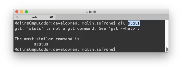
Visibility of system status
The first thing you want to know is your user’s goals and if they can navigate your interface to achieve them. For instance, their goal might be to select their preferences for content they receive in a newsletter. Given a screen full of options, they should be able to distinguish what items they have selected and what remains unselected. Colors, symbols and iconography provide a good contrast to indicate the difference.. It is also important to keep accessibility in mind for all kinds of users. For instance, color blind users may have difficulty when certain colors are used for distinguishing status.
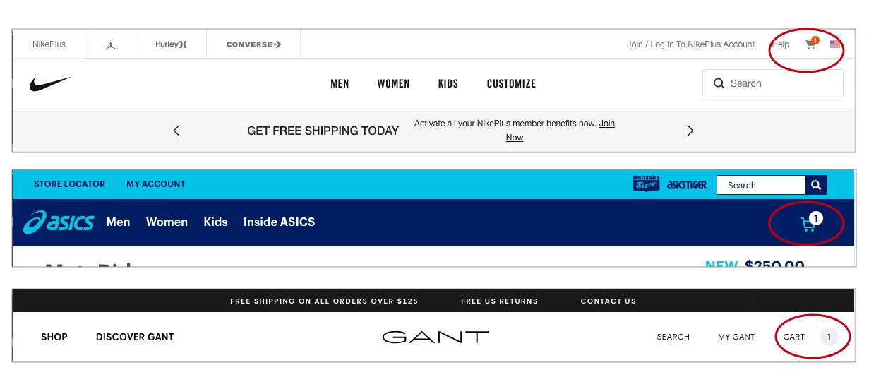
Feedback provided will allow a user to understand if their interactions with the interface have been acknowledged. Most of the time, they want to know the status of your product after interacting with it. Take your favorite messaging app for instance – there are different icons displayed next to your message, depending on whether it’s left your phone, reached the server, delivered to your recipient or read by the recipient.
Speaking the language of the user
The system interface should speak the user’s language. That’s not just localization, but also presentation of words, phrases and concepts that would be familiar. Often companies make the mistake of providing system-oriented terms or lingo that their own teams would be familiar with, but make no sense to a user. It is important to not assume a user is technical or an expert in the industry.
Information should also follow real-world conventions and appear in a natural, logical order to capitalize on what a person already knows. This provides a better understanding and provides some predictability for the user when they perform an action. For instance, a vaguely labeled button on the interface can ruin a user’s experience since it might scare them off from proceeding to next steps. This can be an issue if you’re depending on them to complete a checkout or signup process, as it can decrease conversion rates.
User control and freedom

Sometimes a user may unintentionally make mistakes or navigate to the wrong page. You want your interface to reduce the chances of this occurring, or giving them an easy option to backtrack and correct their mistake. A simple real-world example of this is the "undo" button. It gives users a feeling of control and freedom over their actions.
Making things predictable
Users should not have to wonder whether different words, situations or actions mean the same thing. This is when consistency comes into play again. It’s simply providing an experience that is familiar and comfortable for the user. This is why links for registering and signing into an account are typically found in the upper right corner of most websites. Or why the icon for a shopping/checkout cart is most commonly a supermarket trolley.
Interaface familiarity reduces confusion for users –– that’s why companies should ideally have a design system in place. There needs to be a degree of consistency in what you design and develop, so it gets translated over to the user experience. I highly recommend the use of platform conventions to get that level of consistency on par with user expectations.
Preventing users from making errors
We previously went over how we should enable users to correct errors they make. Another crucial part of that is to prevent them from making mistakes in the first place. This can come in the form of live or immediate feedback. This could look like a short checklist of password requirements for creating a new password. The counterexample is not providing feedback and presenting a vague error after a user has done something wrong –– frustrating for everyone. Autofill functionality is another great example of error prevention. As it checks errors as the user is writing, the user is gently steered towards the correct spelling and not left with them at the end of their work.
Making user interactions smoother

The checklist and autofill features are a good segue into the next point. When building a good interface, we should always minimize the user’s need to recall information. Start by providing information and instructions in a visible or easily retrievable manner. Suggestions help nudge the user to get the information they want.
This means you should be taking steps to provide a better user experience if your interface is unable to provide a high degree of recognition to users. For instance, using labels under non-standard icons, instead of making users try to guess what each icon stands for or does.
Flexibility and efficiency of use
We can help increase flexibility and efficiency of use via shortcuts. Shortcuts cater to all groups of users and help them do things faster. They are often invisible to inexperienced users because they are unobtrusive to the general interface. Hotkeys and one-click checkout buttons are examples of accelerators that can help make an experience more convenient and quick for the user.
Keeping the interface focused
With that in mind, having an uncluttered interface experience can help reduce the level of intimidation and complexity for the user. When there are too many options, it can leave the user overwhelmed and unable to make a decision. This means keeping core functionality under the spotlight. Less commonly used functions should be tucked away but also remain accessible. Again, it’s all about guiding the user to achieve their goals.
Help users recognize, diagnose and recover from errors
Error messages should be descriptive and easy to understand by all users. Having a convoluted code dump or vague error message will ensure your errors are only understood by developers or nobody at all. A situation that does not help the user resolve their problem or get out of a situation.
Ideally a product or interface should be usable without having to consult a user’s manual. Something that can be achieved by applying the principles mentioned above. However, you should also provide help and documentation that focusing on things users would do. This is a big help to new or infrequent users of the platform.
Building better interfaces
Chances are you won’t get it right the first time and that’s alright! Following the principles above and supplementing it with concrete, productive conversations about improvement will help make life easier for your interface design and development processes. The conversations fostered by developers and designers will have cumulative effects that will benefit user experience tremendously over time.
You will be able to break down a generic "the product is good/bad" response and identify which parts of your interface work, and which areas need improvement. Never underestimate the benefits of a high quality discussion and how it gives you actionable tasks for building a better interface and overall product. With a well-received product, comes the associated uplift in usage and revenue.

Inspiration for your inbox
Subscribe and stay up-to-date on best practices for delivering modern digital experiences.
Meet the authors

Malin is a Senior Product Manager at Contentful, leading the Platform Insights team in providing customers with greater visibility into their use of the platform. By delivering analytics, reporting, and governance capabilities, he helps organizations make data-driven decisions, optimize their usage, and ensure transparency. With over a decade of experience in B2B SaaS across mobile and web, Malin specializes in building insights-driven solutions that empower customers. Outside work, he enjoys cycling long distances, running, illustrating, and exploring psychology.
Related articles

Understanding AI by its building blocks: The AI ecosystem
March 5, 2026

Headline testing: Create engaging headlines with A/B testing and generate more leads
April 8, 2025

WordPress to Contentful migration: Benefits, tips, and best practices
May 21, 2025
