Introduction to CSS animations
Published on March 12, 2024


Inspiration for your inbox
Subscribe and stay up-to-date on best practices for delivering modern digital experiences.
Animation is not merely decorative, it is an invaluable tool for creating a better web.
As Rachel Nabors states in her book, Animation at Work, animations within a web app should be an integral part of any design pattern. They can be a powerful tool to communicate the product to the end user by leveraging motion, action, and change.
Within the context of web development, the word “animation” encapsulates a wide variety of changes on the screen — from dramatic movements of elements, to extremely subtle color or shadow changes. Whether prominent or subtle, these changes can help shape the way the user interacts with the feature itself and should not merely be an afterthought once a feature has been implemented.
This blog post will cover examples of how animations enhance the user experience, how to make them using CSS, and best practices to consider when implementing them.
UX benefits of CSS animations
There are many applications of CSS animations that serve to create an eloquent user experience. For the purposes of this article, I have somewhat reductively categorized these applications to highlight two main objectives: decreasing cognitive load and curating a memorable experience for the user.
Decrease cognitive load
Animations can help to reduce the friction that the user experiences with the product, therefore decreasing the cognitive load that results from their interaction. The user can spend less time figuring out how to use the product, and instead, devote that time to the task at hand. Let’s run through some generalized mechanisms of decreasing this cognitive load:
Communicate to the user: Explicitly communicating to the user via an animation is an example of reducing this friction. A common manifestation of this is a loading state.
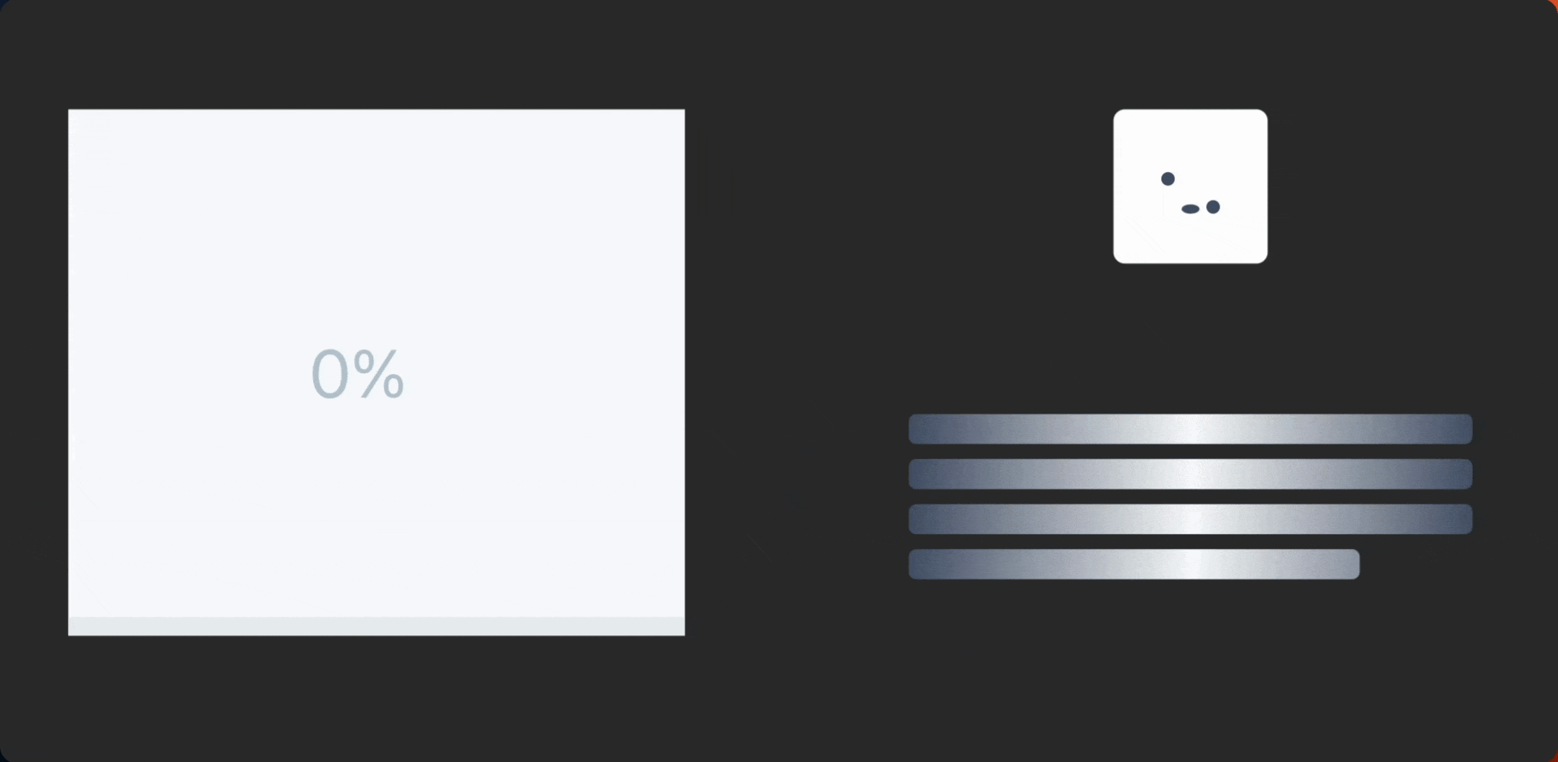
Ideally the user is not staring at a blank screen while waiting for something to happen from their action. We want to give the user something to look at while they are waiting, effectively communicating that all is well, just hang tight. It can also be a fun and engaging experience to watch a unique loading state, and is an ideal opportunity as a designer and developer to inject some creativity.
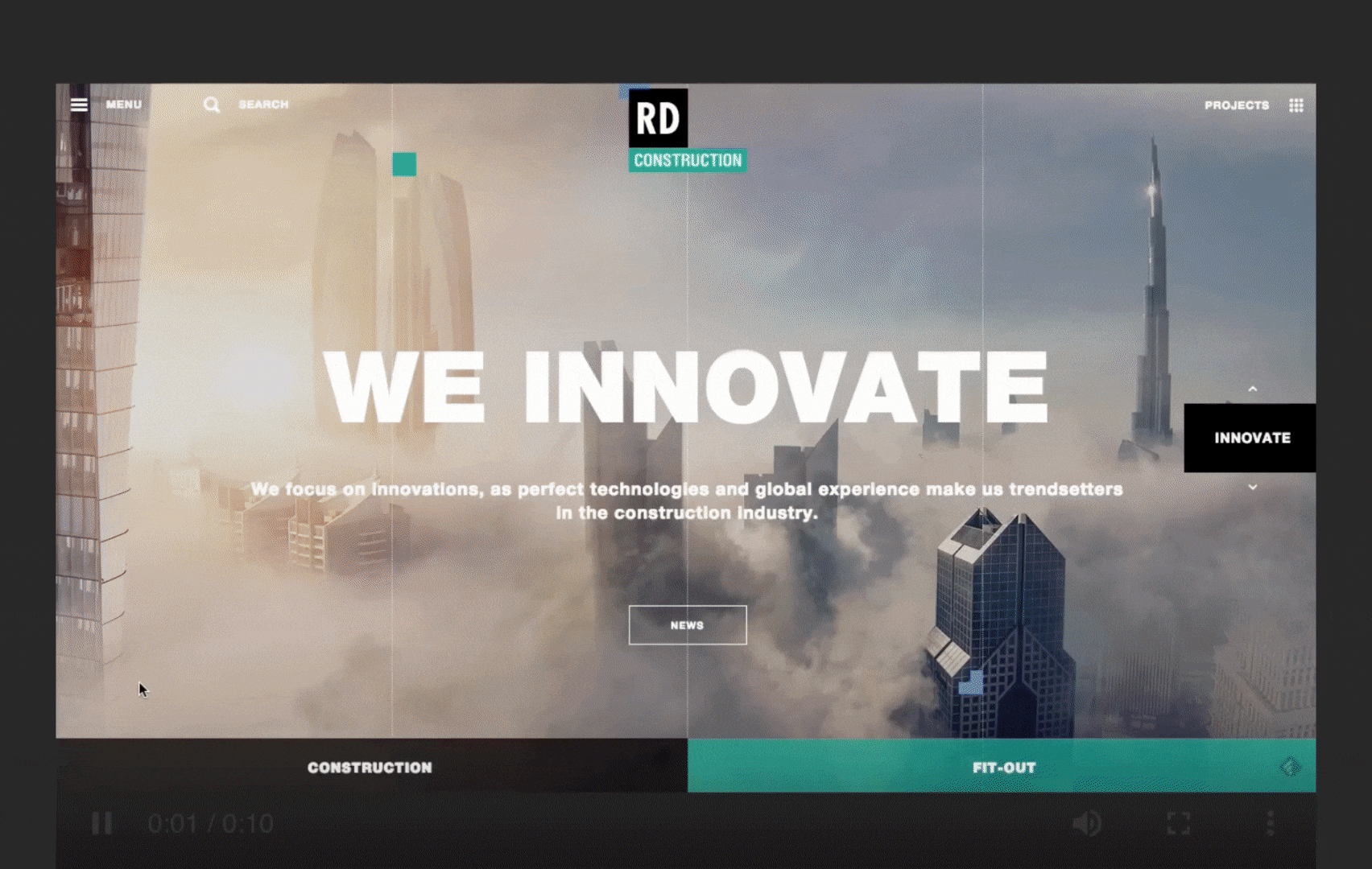
Spatially orient the user: Animations can also be used to spatially orient the user on the page, and reduce any confusion they may have while navigating the site. An example of this is a carousel component.

The animated transition between each step helps to create a metaphor of motion that gives the illusion that the user is actually walking through each step. Each step communicates subtly where the user is, where they have been, and where they are going next.
Provide feedback: Riddled throughout many web pages are subtle animations that provide feedback to the user, most likely after they perform an action. One extremely common example of this is the background change on a button immediately after clicking it.
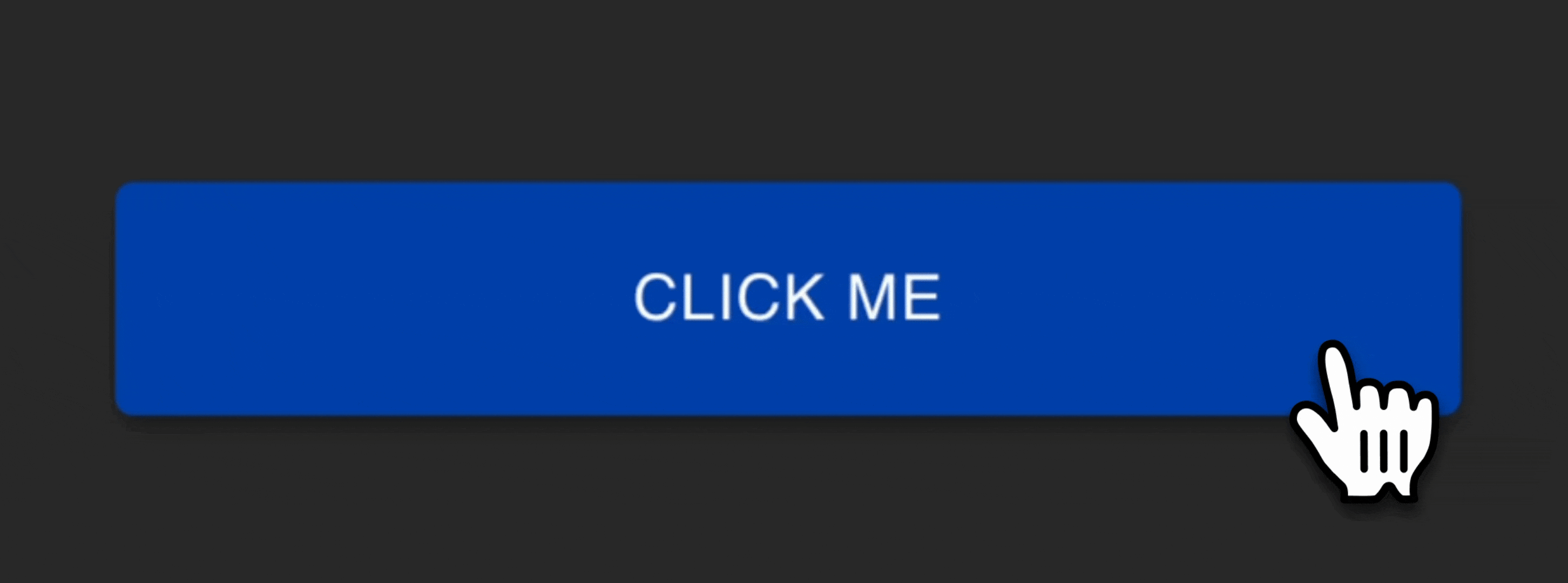
While subtle, this animation tells the user that they have effectively clicked the button, and that they can wait for the result or move on to the next task. Without this feedback, the user may be stuck wondering if the button was ever clicked.
Transition supplemental information: Supplemental information is information that is not part of the main frame, but is part of the task at hand. Common examples of this are a slide-in component or a dropdown. Below is an example of a dropdown that actually encapsulates two animations.
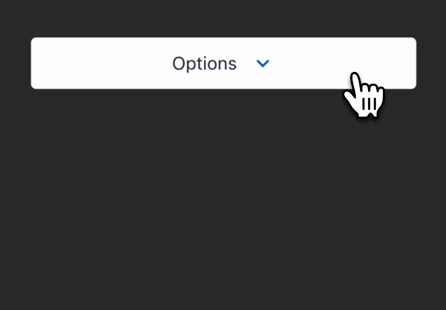
The first animation is the carrot that flips up and down. The carrot helps communicate that there are two states to this element: open and closed. The rendering of the popover itself reflects the second animation: a smooth transition of the component into the field of focus.
Below is a direct comparison of a popover utilizing a smooth transition versus a popover with no a transition.
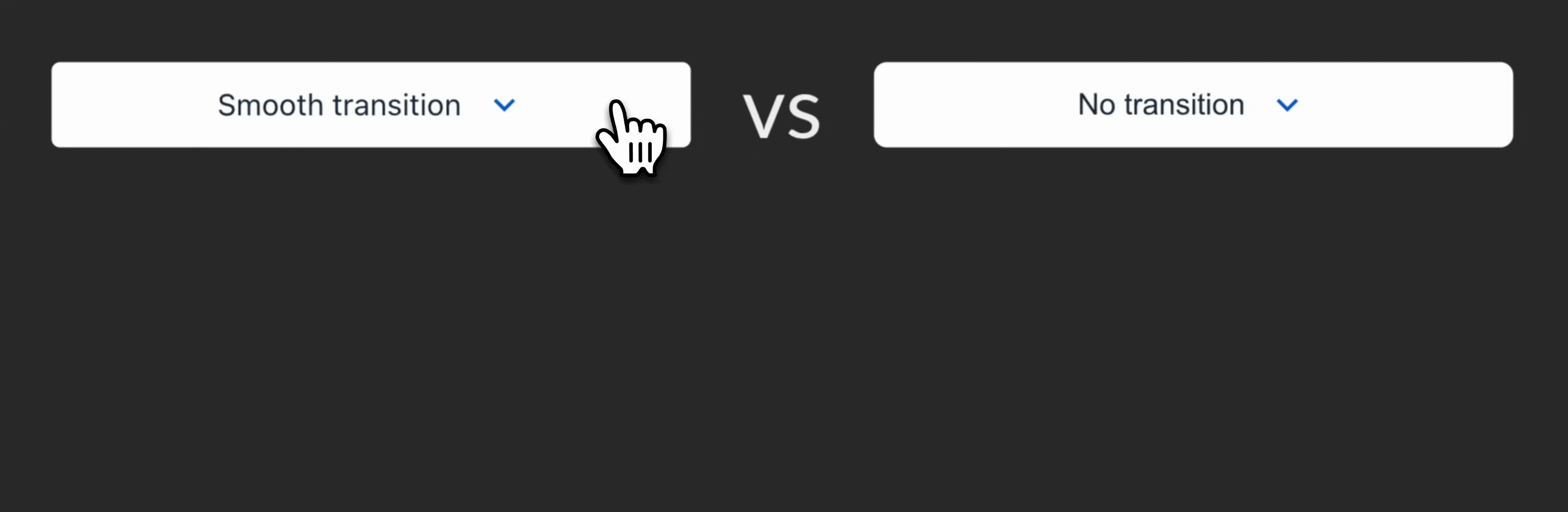
Although this is again a subtle example, the smooth transition of the popover helps to avoid jarring the user. It is simpler and more peaceful for our brains to process gradual changes, such as a nice sunset or seasonal change, as opposed to a sudden event.
We, as product designers and developers, want to avoid pressuring the user’s brain to reacclimate when a jarring change happens, even if it's something as simple as a component popping up on the screen.
With a smooth transition, the user can process, adjust, and move straight into the task at hand without any sort of friction or time taken to reorient.
Curate a memorable experience
While interacting with the website Trainline recently, the power that animations have in crafting a memorable brand and experience for users was reaffirmed.
During my first visit to the site, I submitted a collection of personal information as part of a form, but for some unknown reason, I was immediately redirected to an error screen, shown below:
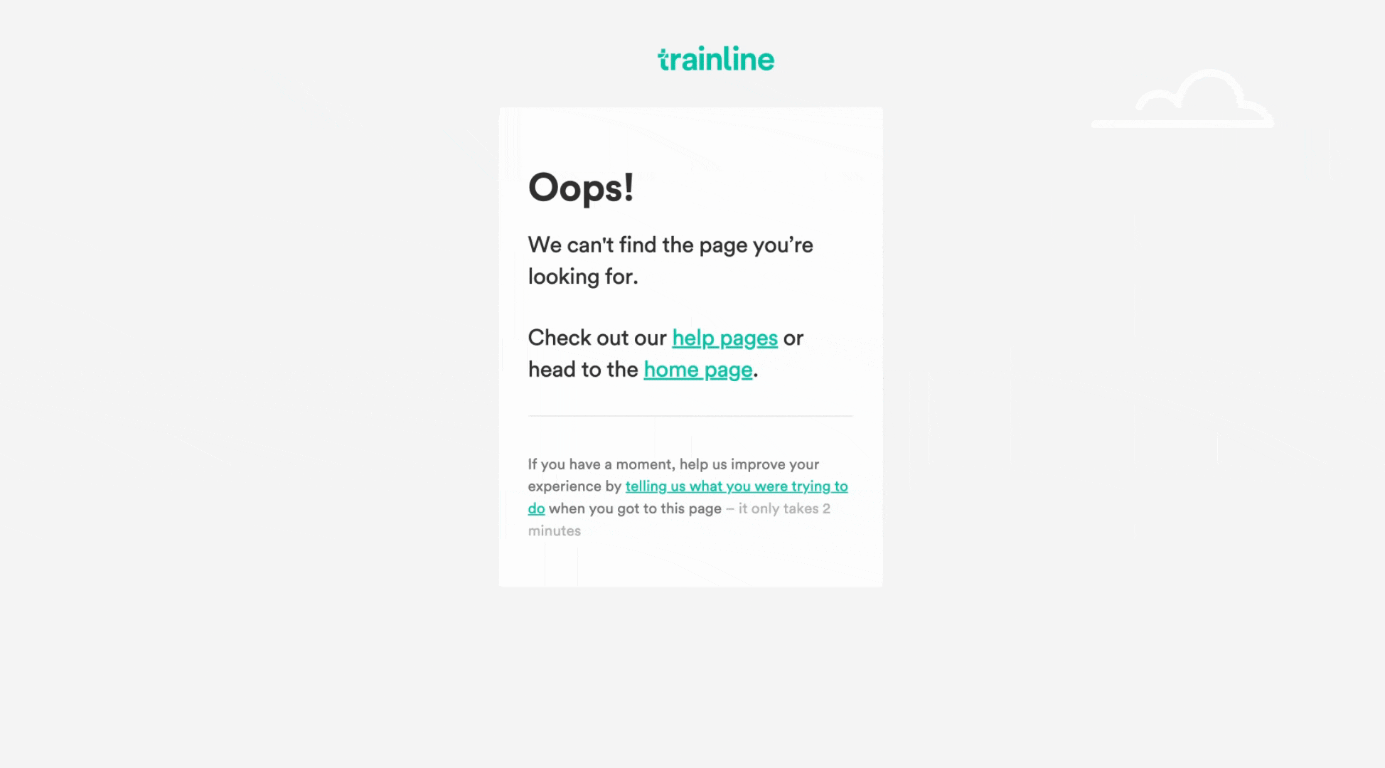
Now, instead of being annoyed that all the information I entered had seemingly disappeared and I am now stuck on an unintended screen, I actually became re-engaged as I watched this fun train animation. What a unique feeling to have on an error screen: delight.
In that moment, this animation accomplished two main things: it reaffirmed the brand’s friendliness and solidified itself as a reputable site. Especially as a developer, I recognized the effort they put into making this animation and the genius of adding this element to their generalized error screen, which is often an afterthought or “throw-away” for a site.
I immediately concluded that the error was not because the site was unreliable, but because of a one-off issue. I continue to use this website to this day, so they have retained an additional customer, all thanks to a very intentional animation.
How to make a CSS animation
There are two main properties to use when building CSS animations: transition and animation. Let’s compare their capabilities:
Transition | Animation |
|---|---|
Runs from a beginning state to a final state, once through. | Can run through multiple states, and can do so infinitely. |
Best for simple animations. | Best for more complex animations. |
Needs a trigger, such as a user click. | Can be triggered automatically without user interaction. |
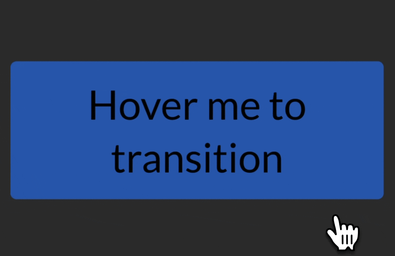
Transition
Below is a code example of using the CSS transition properties:
The attributes in the above code example are fairly straightforward:
Property | Function |
|---|---|
The CSS property that will be transitioning from one state to another. | |
The duration of the animation, starting from user action. | |
The delay of the animation start. | |
The actual manifestation of the transition, i.e., “how it looks” to the eye. |
There are a variety of unique transition-timing-functions to play around with, and there has been quite a bit of research into what timing functions are optimal for certain animations. Exploring this further warrants another blog post entirely.
The initial background-color of the button will begin as a lighter blue, and when a user hovers, the transition to a darker blue will occur, as shown below:
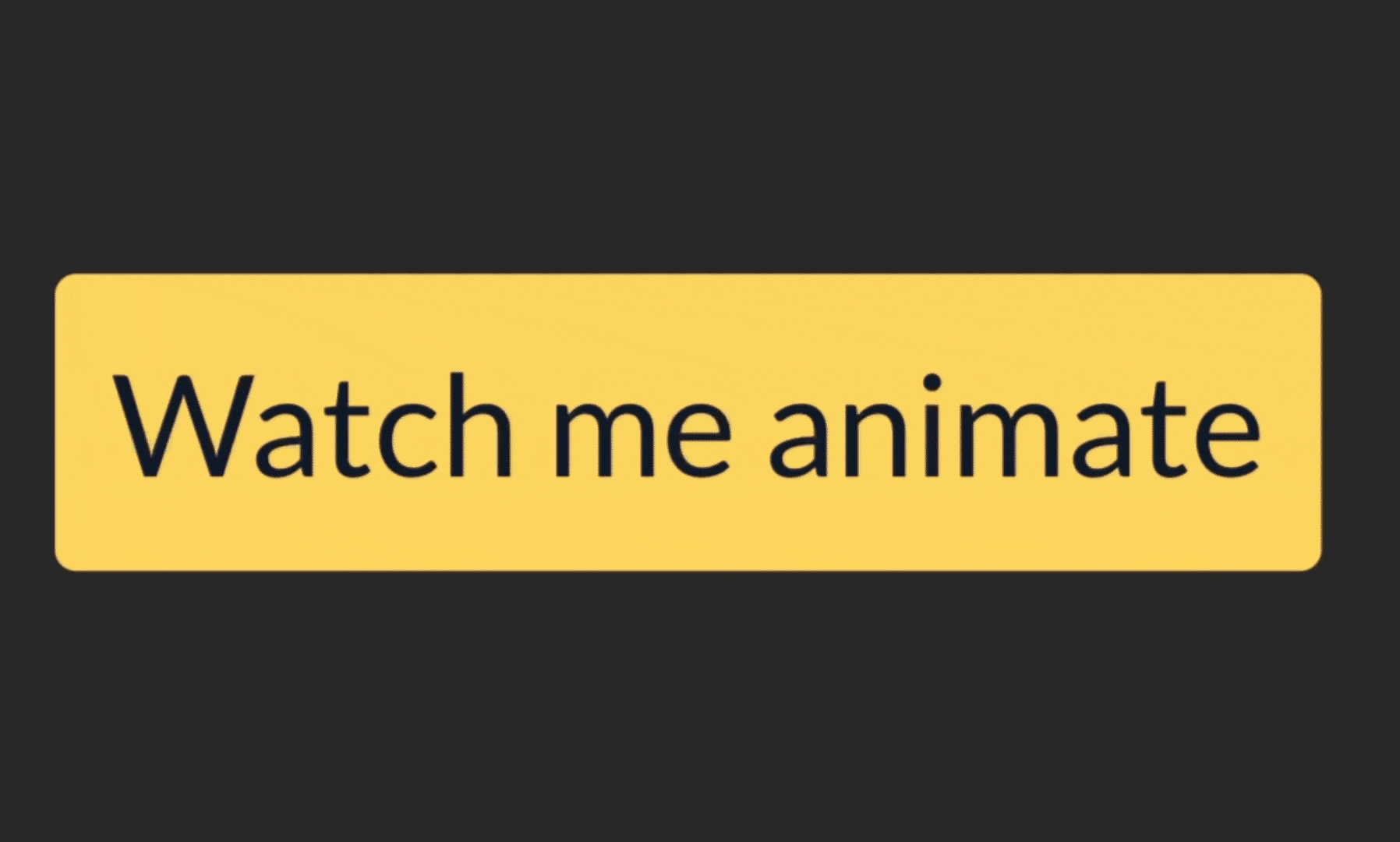
Animation
Below is a code example using the animation properties for the same element:
The @keyframes attribute here is unique in that it facilitates the automatic nature of this animation. It explicitly describes what the value of the animated property will be at what time point during the three-second duration.
In the very beginning, the background color starts as yellow, and then it will change to orange, then to purple, and then to red. Since the animation-iteration-count property is infinite, it will then repeat accordingly.
The animation-name property maps to the correct @keyframes property, so be wary of global name collisions here. Creating a thoughtful animation name can only benefit the future developers and consumers.
Take a look at how this same element’s background-color now moves through several states without user interaction:
Animation best practices
There are several best practices to consider when implementing animations using CSS, two of which we will dive into: performance optimization and accessibility.
Let’s first discuss how we can optimize the performance of the webpage when implementing animations.
Performance optimization
There are many steps between the code existing locally on one’s computer to its actual existence on a browser web page. The browser rendering pipeline encapsulates the majority of these steps, and there are three in particular that are important to understand when creating animations.
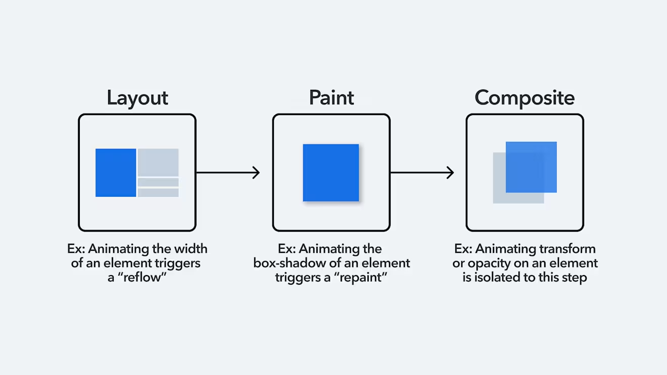
The Layout step calculates the geometry and position of everything on the web page. This is a fairly expensive calculation, and so if we were to choose to animate a property that contributes to the layout of the page, such as the width of an element, this would trigger a “reflow.” Since this is a cascading pipeline, triggering a reflow triggers the Paint and Composite step again as well.
If we choose to animate an attribute isolated to the Paint step instead, which is the step that adds pixels to the page, then we trigger a “repaint.” Animating the box-shadow of an element is an example of this. This is slightly less expensive than animating a Layout property, because we now only retrigger the Paint and Composite steps of the pipeline.
Luckily, there are two wonderful properties that are isolated to the Composite step: transform and opacity. Browsers are incredibly smart, and when nodes exist on the page that have either of these two properties, these nodes are promoted to their own layers. This means that their lifecycle on the browser will be isolated from other changes that may be occurring, as an effort to optimize the reflows and repaints of a webpage. Additionally, these layers are calculated on the GPU as opposed to CPU, which is highly optimized to handle changing nodes, such as those that are animated.
Therefore, utilizing transform or opacity are great options to animate the page efficiently, and both properties provide a broad range of animation capabilities.
Accessibility
It is critical to consider accessibility when developing an animation. Every user perceives animations differently, and they may or may not want to engage or see an animation when interacting with a web page. Take a look at the following parallax animation:
In my opinion, there are not many justified use cases to have an animation this dramatic, nonetheless, the web is littered with them, and occasionally these animations can cause some people to become ill, mainly those with vestibular disorders.
For animations that are complex like this, and even for animations that are simple and subtle, it is imperative to consider the reasons that a user may or may not want to interact with the animation. There are several guidelines that can provide insight for how to make these considerations, one of them being the Web Content Accessibility Guidelines.
Below are the animation-related guidelines from the WCAG:
Pause, Stop, Hide: This guideline applies to animations that are automatic, occur without user action, exist in parallel with other content, and occur for five seconds or more. If the animation meets these criteria, then the user must be given the ability to pause, stop, or hide the animation.
Animation from Interactions: This guideline is very similar to the first, with the difference being that the animation is triggered by user interaction, and must give the illusion of motion, so not just a simple change in background color. The user must be given the explicit ability to disable this animation.
Three flashes or below threshold: It is advised to not have more than three flashes per second in an animation. There are limited justifiable reasons to exceed this threshold, but this guideline supports accessibility and helps ensure a safe experience for users prone to seizures.
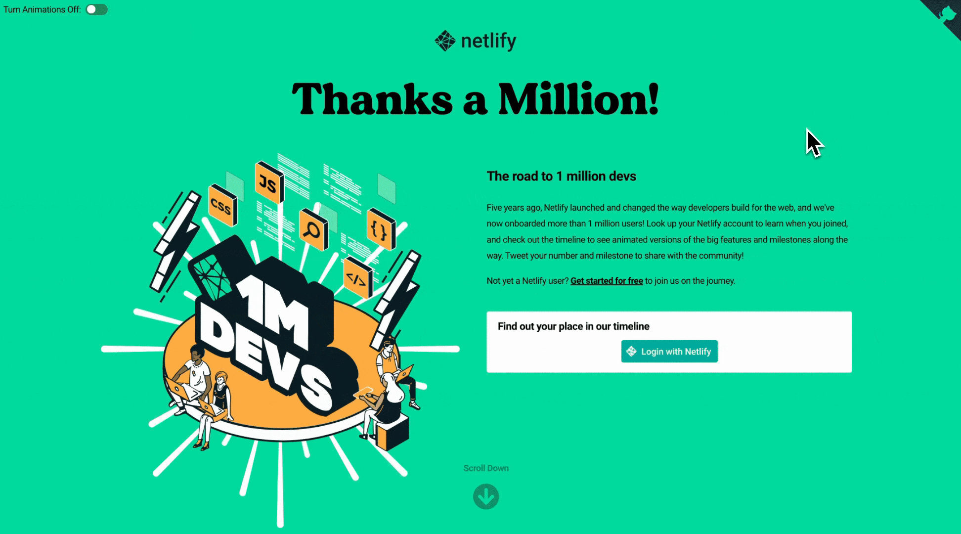
Below is a strong example of providing users with an explicit toggle to disable all animations. This Netlify webpage is supporting accessibility by giving the user a choice of interacting with potentially problematic motion animation.
The Web Content Accessibility Guidelines are a great reference for how to tactically shape an accessible web, and thankfully, there are also several more tools at our disposal to support this same effort — one being the prefers-reduced-motion media query.
This media query is a tool that can be used to tailor the web experience to personal user accessibility settings on the user’s device. As a brief history, it was introduced by Apple in 2013, in response to many users actually falling ill from the parallax animations that they had on their website.
By adding an OS accessibility setting on Apple devices, allowing users to prefer reduced motion, we can subsequently listen for these user device preferences and conditionally render animation. This setting is now standard across most, if not all, operating systems and browsers.
There are judgment calls to be made regarding whether an animation should be rendered conditionally based on these settings, especially if it is imperative to the functionality or experience of the web page. But nonetheless, it is another tool in our developer toolbox that allows us to create a more inclusive web that is gracefully tailored to each user's personal preferences.
Conclusion
Animations are and should be foundational in how we design and develop a web product. It is clear that when thoughtfully integrated, there is much to be gained from incorporating animations — whether it is creating a better user experience or helping to build a memorable brand.
CSS is a great tool to implement animations, but it is certainly not the only tool. There are a wide variety of implementations using JavaScript, the Web Animations API, and other third-party libraries. However, it is important to embrace how much can be accomplished using fairly native CSS functionality right at our fingertips — without the need to learn a new language or install a library.
It is imperative to keep animations purposeful, as it is easy to be heavy-handed with too much movement on the web page, which can lead to reduced usability and an overwhelming experience for the user. Animations should be implemented in order to solve a problem, likely in the user experience, or to contribute to the overall brand identity.
It is important to prioritize these efforts while developing features on a team, but worthwhile to stay anchored in the intent of, and best practices for, the use of animation.

Inspiration for your inbox
Subscribe and stay up-to-date on best practices for delivering modern digital experiences.
Meet the authors

Lillian is a Software Engineer that primarily focuses on supporting the integration of third-party applications into the Contentful ecosystem. She has a passion for frontend architecture and product design.
Related articles

Understanding AI by its building blocks: The AI ecosystem
March 5, 2026

TypeScript interfaces: How-to guide, best practices, and code examples
April 23, 2025

GitLab vs. GitHub: How are they different in 2025?
June 11, 2025
