How product design makes Contentful a delight to use
Published on April 14, 2022


Inspiration for your inbox
Subscribe and stay up-to-date on best practices for delivering modern digital experiences.
As a designer, I want customers to love using Contentful. I want to design features that exceed customer expectations and delight them. Delight is a word that is thrown around a lot in tech. In this post, I’ll explain what it means at Contentful and how we use delight to address the emotions and needs of our users.
When I first started at Contentful, I noticed there was something missing in the product. Despite delivering flexible features that serve our customers in hundreds of different ways, it felt a little dry and indifferent. This was a contrast to our brand, which is warm, playful, and authentic.
After speaking with other designers and UI engineers, I realized quite a few of us were interested in bringing more personality and life into the product. That’s when I saw an opportunity to champion delight. My goal was to carry the positive vibes from the brand into the product experience.
Impact of delight on a product through the Kano model

The Kano model elegantly explains how delight impacts products. The Kano model of product development and customer satisfaction was first published in 1984 by Dr. Noriaki Kano, professor of quality management at the Tokyo University of Science.
Based on a survey Kano conducted with 900 people, the model shows that customer loyalty is connected to our emotional response to product features. There are basic features that are “must be” which customers expect to have. If these customer needs are not met, they will not be satisfied with their experience.
Once a product has met all expected “must be” features, creating “delighters” will allow the product to stand out and excel. Delightful features are often things that customers haven’t asked for directly — they are unexpected, nice surprises.
Kano says that a product is about much more than just functionality. It is also about customers' emotions.
For example, standard “must be” functionality of a phone is to take photos and send messages. However, the major phone brands have added delight into these standard features such as text extraction and portrait mode in their camera, or screen effects and voice notes in their text messages. This attractive quality is what makes the difference when a customer is choosing which model to buy.
Not only do delightful features influence people's purchasing decisions for a new product, they also increase user expectations of other products, therefore encouraging innovation and raising the standard of product UX in the market.
We started by introducing microinteractions
Microinteractions are an often-overlooked part of product design. And yet it’s a fantastic way to create delight among customers.
They are an important tool in building a relationship with your customers. These unexpected but useful microinteractions create a brand personality and show we are maturing as a product. Contentful has a distinct and fun identity which could also be reflected in our products.
In order to set some guidance around delight, I created the delight scale. This is used to determine the level of delight we should use in each interaction. My goal was that this scale would give designers confidence to weave delight into their solutions.

Error message: Only simple validations or system error messages, never critical or serious ones. Delivered with microcopy.
Success message: Point at which user has successfully completed an action, e.g. buying a space. Delivered with microcopy and tiny imagery.
Empty state: Moment where there is no data to display to the user, e.g. a form or empty library. Delivered with microcopy and large imagery.
General loading state: General loading state between each page. Delivered with microcopy and animation.
Special loading state: Once-off loading state for a significant action, e.g. crafting a space. Delivered with microcopy, large imagery and animation.
Contentful uses delight to apologize for a negative experience, amplify a positive one or distract from waiting. The idea is to mirror users’ feelings in order to establish an emotional connection with them. Then, we can use the delight scale to understand which elements we could use to convey delight.
For example, our previous general loading state was the spinner below. Users saw this every time they moved between pages. As you can see it’s pretty basic and forgettable. It also did not provide users any feedback on how their page was loading, and could cause dissatisfaction.

We took into account three objectives when developing a new loading state:
Create a distraction while users are waiting that reflects the brand personality.
Provide feedback if the page was taking too long to load.
Ensure design wouldn’t become “annoying” after repeated display.
The delight team decided on a simple ball loading animation with randomized funny messages. I crowdsourced the messages by sharing a questionnaire in Contentful. I wanted to have a diversity of opinions and senses of humor.
My favorite messages were “Searching for my left ear bud” and “Straightening the bananas.” If the page took more than four seconds to load we displayed a message “Sorry, this is taking longer than expected!”
Here’s the end result:

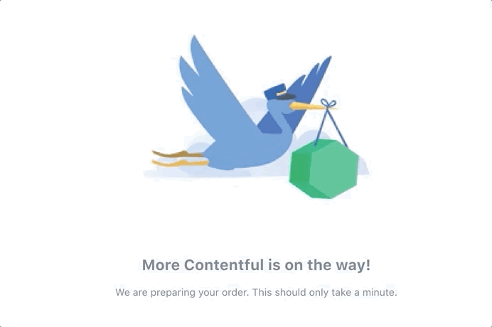
We also created these special loading states for once-off significant actions. Here’s what you see when we are onboarding users in our Compose app:
Looking at the best ways to decrease the cognitive load
Psychology tells us that cognitive strain is directly related to lower credibility. When a user is forced to invest more effort into moving through a product, they become more vigilant and view the product as unfamiliar. If it takes too much effort to process the information, performance suffers.
Minimizing the cognitive load is extremely important when designing. The lower the cognitive load, the more at ease and familiar a user feels. This can be tricky when designing new features for Contentful as it’s such a departure from monolithic CMSes. It can be easy to overload users with information.
There are a few ways in which we reduce the noise and cognitive load:
Anticipatory design: Answer users’ questions before they raise them; whether this is sorting a list intuitively, creating clear navigation, or automating a task where possible.
Simplified copy: Simplify the user’s path to the goal as much as possible. Providing all related information can be tempting, but is not the ideal way to present it. Consider the lifecycle of information and make sure it’s not persistent if the user only needs it once. Use progressive disclosure and give users information as required.
Meaningful imagery: Images can be a powerful tool in influencing users’ experiences or perceived experiences. A single image can convey more to the observer than an elaborate block of text. Images can cross language barriers in a way text simply can’t.
Make good decisions easy: Eliminate barriers that make good decision-making difficult. When asking users to make a decision, give them options. For example, if users need to reverse course and correct an error, provide choices to correct it immediately and move onto the next task.
Where to go from here
Applying the Kano analysis and writing these principles was the easy part. Now, product designers need to examine the way we create new experiences and establish a methodology. One way we do this is by checking in with each other weekly. Product designers review each other’s work to ensure that we’re making the right decisions.
A massive part of this will be educating our engineering and product teams on the importance of delight in our designs. We all collaborate on the final product, and an understanding of these fundamentals is critical for getting others on board. If you or anyone you know would like to learn more about these principles, I recommend reading UX of microinteractions or Cognitive psychology in UX design: Minimising the cognitive load.
And of course, if you haven’t already seen the exciting features of Contentful for yourself, you’re invited to sign up and start building your own delightful experiences today.
Inspiration for your inbox
Subscribe and stay up-to-date on best practices for delivering modern digital experiences.
Meet the authors

Grace was a product designer at Contentful. She’s also a YouTube pilates student, an aspiring vegetarian and a poet.
Related articles

From data to insight: The growing role of AI in analytics
May 8, 2026

Where creativity meets reality: Optimizing marketing asset management for faster campaign delivery
December 1, 2025

What’s a digital experience platform?
May 30, 2025
