Creating an accessible color palette for Forma 36
Published on August 19, 2021


Inspiration for your inbox
Subscribe and stay up-to-date on best practices for delivering modern digital experiences.
As designers, creators, and web developers, we have a responsibility to create an inclusive web for people of all abilities. It's something we're always working towards when we're designing at Contentful. So, naturally, it became a major consideration in regard to Forma 36, our open-source design system.
Like all good design systems, ours is a perpetual work in progress. Recently, we turned our attention toward our use of color. When designing with color accessibility in mind, you're enabling people with visual impairments or color vision deficiencies to interact with your digital experience.
While there are guidelines on when and where to use color for accessibility, we focused on the colors themselves. Our goal was to meet the Web Content Accessibility Guidelines (WCAG) for color contrast without compromising our aesthetic.
What followed was a real journey of trial and error. We learned a lot about how color behaves, automating our processes, and adopting new tools like the CIELAB color space. In this blog post, we’ll share our process, tips and tricks in the hope that it makes your journey to color accessibility a little easier.
Let’s talk color spaces: a quick rundown
To talk more on our process, it’s important to do a quick rundown on color spaces and the attributes of color. Even non-designers might be familiar with standardRGB, the most dominant color space. StandardRGB (sRGB) expresses color through the combination of red, blue and green. While sRGB is the default color space in most applications, we're beginning to realize it might not be the best for accessibility.
The problem with sRGB is that it was created and optimized for screens and printers, and not for the human eye. Therefore –– and stay with me here –– it is hard to discuss in terms that humans understand. With an sRGB color, you can’t ask: how bright is it? Or how saturated is it?
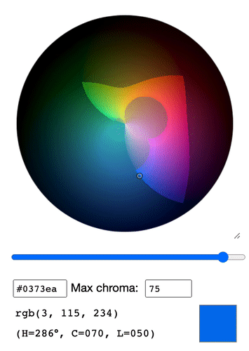
In response to this problem, some smart minds over at the International Commission on Illumination (CIE) created a color space based on human perception. LAB (or CIELAB) is optimized for the human eye, and the language around it is easier for us to use and understand. It expresses color as Lightness (black/white), “a” (green/red) and “b” (blue/yellow). Ater developing CIELAB, the CIE team made the process even more human-friendly by introducing another color space called LCH (sometimes referred to as HSL). LCH stands for Luminance, Chroma and Hue.
Hue: What color is it?
Chroma (or Saturation): How colorful is it?
Luminance (or Lightness): How bright is it?
As humans, we often think of distance or visual weight between colors. The LAB and HCL color spaces, unlike sRGB, take this into account. This is a concept called perceptual uniformity. While it’s a concept that certainly deserves a deep-dive, in simple terms, a perceptual uniform color space is one where distance is meaningful. And because distance is meaningful, designers can work with intuitive dimensions to find colors of equal brightness, chroma or hue. These consistent values ensure (mostly) consistent contrast ratios, which is what we’re using to develop accessibility into digital products.
What we started with
When we started, we quickly realized that we had some work to do to meet the contrast ratios and improve our colors. Our colors weren't predictable or perceptually uniform; every color that we used behaved differently when it came to luminance and chroma.
Also, in our previous efforts to make our colors accessible, our aesthetics had taken a hit. To meet the contrast ratios, we had made our colors dull. We also had too few color shades in our palette. Our colors were categorized by use, e.g. “color-border” or “color-text,” which made them hard to talk about and limited our flexibility.
Our process
Our first decision was that we didn't want to change our colors radically. We decided to start with blue, our base shade, for our new color system.
Blue was an obvious choice because it's our primary color and the most prominent color across our marketing. We started by manually tweaking our shades of blue –– adding a bit of saturation and vibrancy –– while checking that they met the contrast ratios. When we nailed down the blue, we wanted to figure out the rest of our base colors.
We started working on other colors manually, navigating in the uniform color space. We used language such as "Can we add a little more red here?" or "This feels too close to yellow," before coming to the swift realization that this process was random and not replicable at all.
If we continued this way, our colors would have been all over the place. We needed better language to discuss our work amongst the team. Quantifiers such as "a little" or "a lot" mean different things to different people, and when it came to documenting our process, they weren't helpful.
We needed a declarative and predictable color model that was easy to modify on specific attributes, based on the base blue. It became clear that we needed to power this process with code.
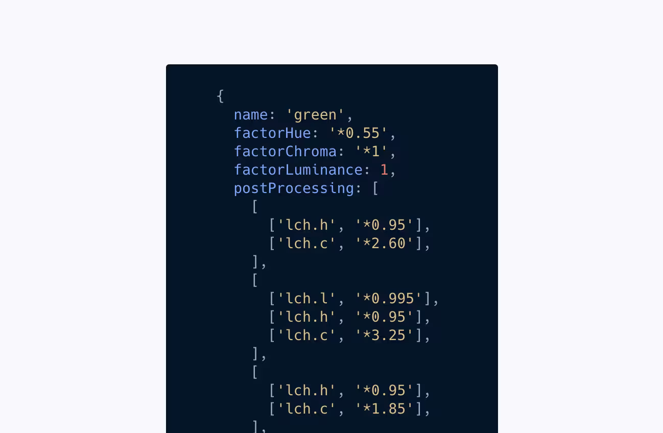
Our solution was a Figma plugin powered by chroma.js. The plugin took our base blue as the only input and used the HCL color space to infer our other base colors. For example, this is how we defined our base red:
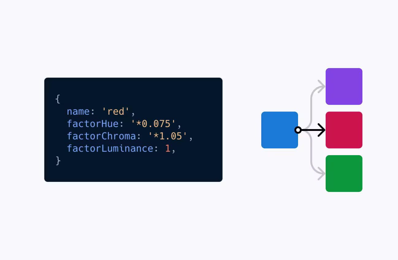
We multiplied each channel (hue, chroma, luminance) in the color space by a certain number, tweaking it along the way. The luminance remained the same thanks to the perceptual uniformity of the color space. The chroma increased by just a little to give the color some more “punch.” Of course, the hue changed substantially but remained in the same color space.
From here, we were able to define the characteristics of our base colors just by adjusting the blue –– the Figma plugin could take any shade of blue and generate a full palette. You can see in the example below that a dull base blue leads to a more dull color palette across the board.
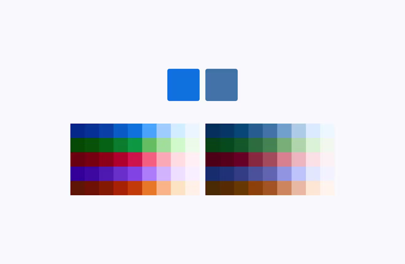
The key is that all colors retain the same luminance value, ensuring a consistent base of contrast ratios and perceptual uniformity.
The only problem? Yellow. Yellow is a little different from most other colors. We needed to keep yellow because it's a key color in our branding. Thanks to the sun, yellow appears brighter to us than other colors. Finding a true yellow that wasn’t too dark with the right contrast ratios was a challenge. The solution was to increase the luminance to get a true yellow, and not a muddy green or orange.
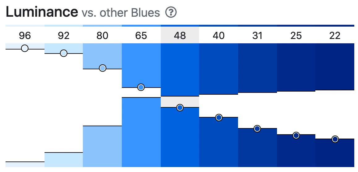
Once we were happy with our six base colors, we created a unified color scale of light and dark shades. We used the HCL color space and mixed our base colors with black and white. This changed the luminance, giving us lighter and darker shades of our colors. The result was a color palette with almost identical contrast ratios between the shades.
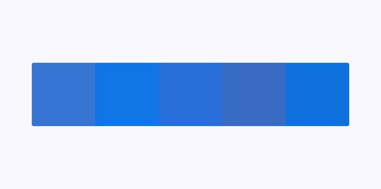
When we were working on these shades, we realized that only having five shades of each color was quite limiting. When it came to subtle interactions, like hover transitions, we needed more choice. Also, looking at the progression of luminance across the scales, there were empty spots –– almost like we were skipping shades:

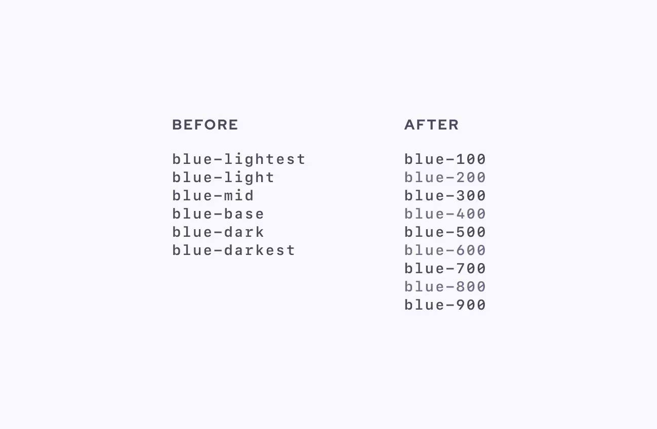
So, we decided to add intermediate steps and scale from five to nine shades per base color. We could describe them on a numerical scale from 100-900 and eliminate our arbitrary case-by-case naming conventions. Goodbye and good riddance, color-blue-darkest, text-color-mid.
While we can summarize what we did in a few paragraphs, this part of the process took time and figuring out the steps was an iterative process. It was difficult to balance how much we allowed use cases to define luminance values. A lot of the time when designing, you're layering colors on top of each other. We had to look at possible use cases and different color combinations and layering options for each color to see if they still met the color contrast ratios.
For example, the lightest color value would only be used as a background (in warning messages and notes). The mid or base color needs to be used as text and background. Do we adapt the luminance according to how the colors will be used and layered? Or do we keep them consistent to allow for other unforeseen use cases in the future?
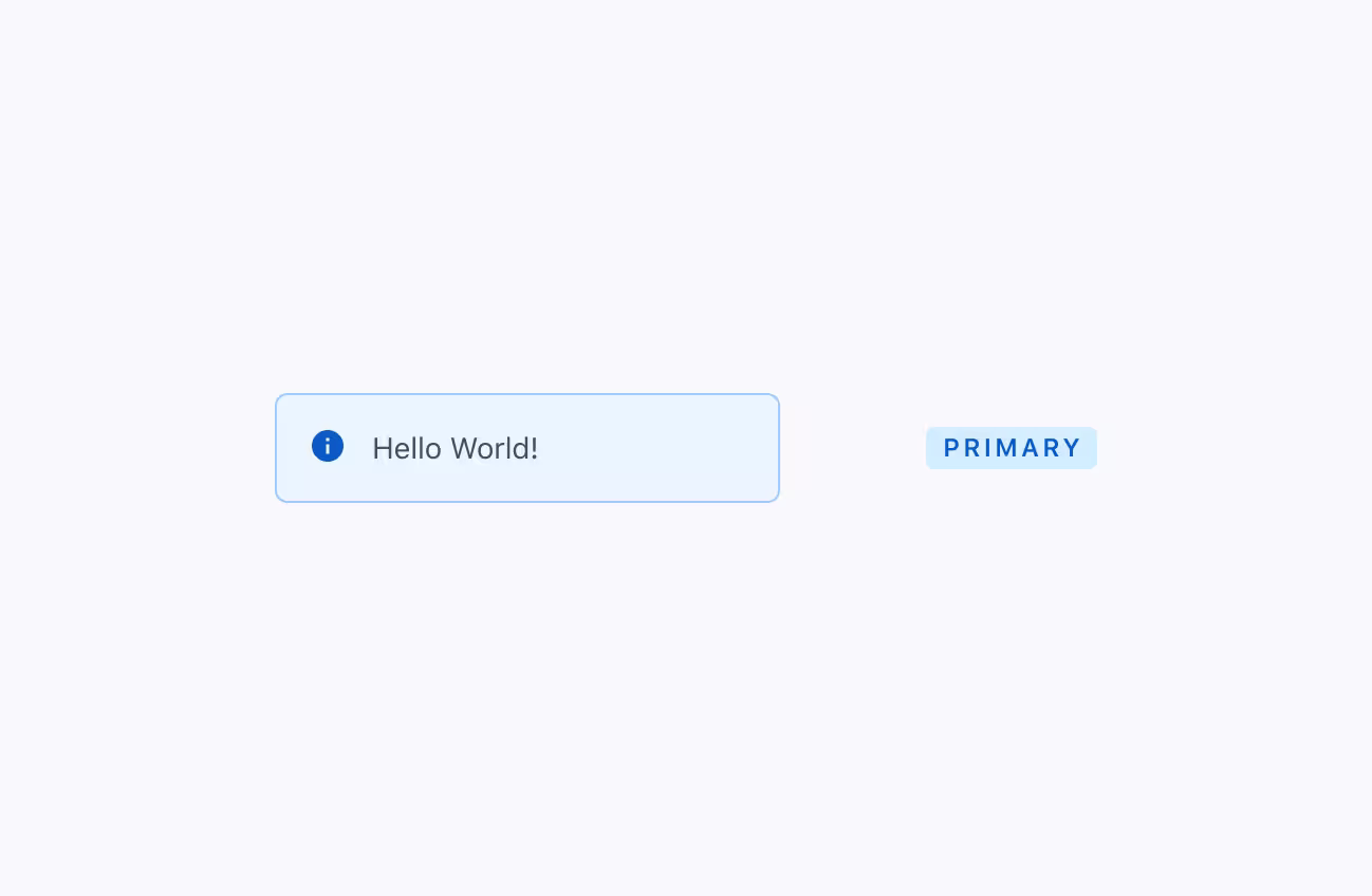
Eventually, we landed on a somewhat smooth curve with more subtle differences in the lights than in the darks. This suited us because we needed more flexibility with the light shades. For example, take this difference between the backgrounds of our Note (using blue-100) and Tag (using blue-200) components:
Now, not only did we have our six base colors, but a consistent scale that we could programmatically apply to each color. And it was all based on a single shade of blue. But before we could sit back and relax, we still had to fine-tune each color value.
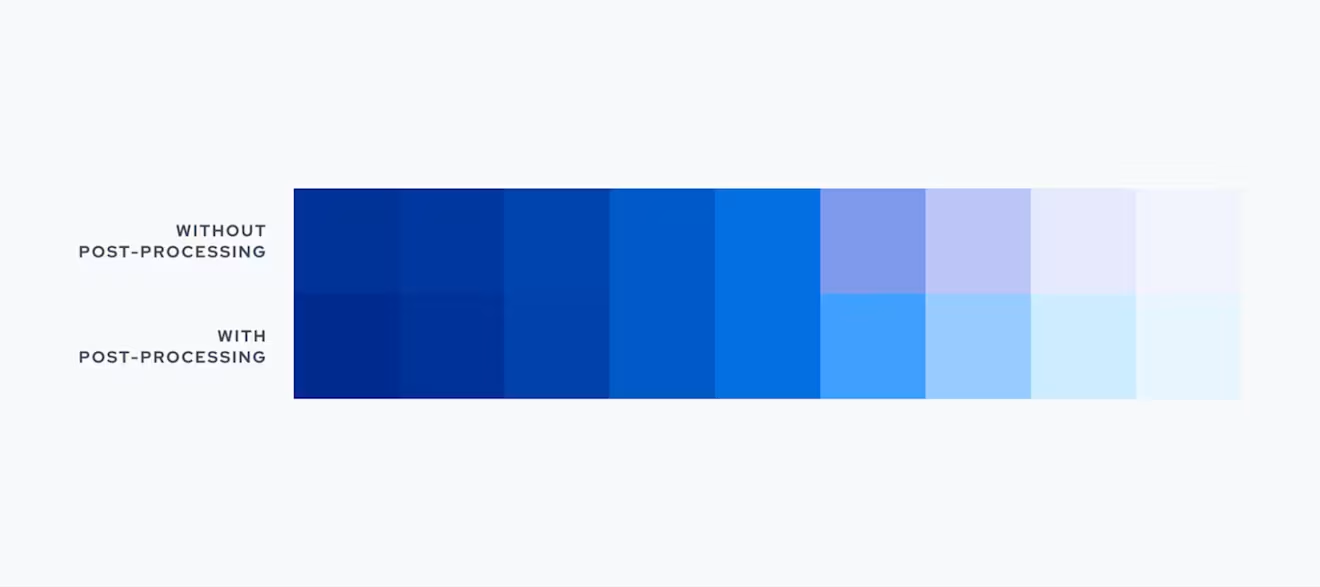
Despite the great tools, we needed to check for edge cases that broke our accessibility rules. This task was pretty mundane and finicky, so we turned to our tool arsenal and set up a browser-based tool to directly manipulate each color.
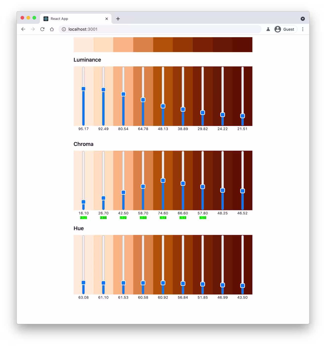
This tool calculates values that we could put into our Figma plugin. We called these values postProcessing — just to be fancy. It's here we could play around with the color. We could use the tool to add more luminance to improve the contrast ratio and bump up the chroma in the lighter shades to make them look less washed out.
We've found this to be a common pitfall when using the HCL color space. Colors tend to lose a lot of vibrancy when mixing with white. In some cases, like our base blue, we had to fine-tune the hues in the lighter shades, or they were too purple.
A quick note on gray
By taking away the vibrancy from our blue, we generated a scale of grays. We were pretty happy with our previous grays, so we kept them close to what they were before. We unified the token naming and brought them to a single scale. Like our other colors, they were named according to their use cases. And now, we have gray 100 through to 900.
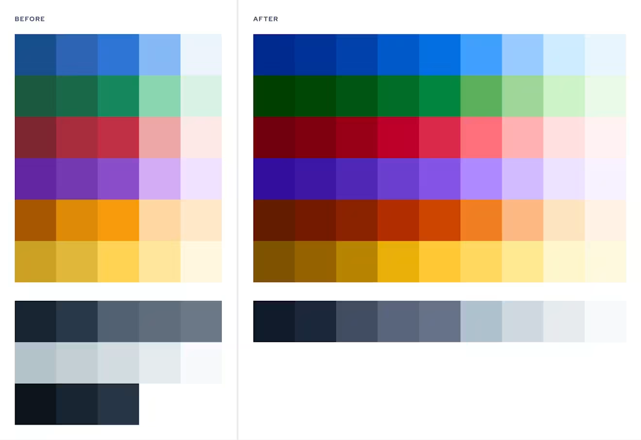
Our results: an accessible and vibrant color palette
After numerous iteration cycles, extensive auditing for contrast ratios and color blindness, and a lot of fine-tuning, we finally committed to a color palette. The palette consists of saturated, vibrant shades with predictable contrast ratios that are accessible according to the WCAG 2.0 guidelines.
There are more shades for more flexibility. A new naming convention makes it so much easier for our designers to use and combine colors. Accessibility is built into the color system. It's not an afterthought or an extra consideration, but front and center like it should be. We are happy with the process that got us here and wanted to make it easier for others to do the same.

Six key learnings
Looking at how we communicated color taught us so much. To create an accessible color system, we needed to be able to talk about color in a consistent, effective way. No more, “little less red” or “a dash lighter.”
Don’t feel bad when things don’t line up perfectly. Our yellow isn’t perfectly consistent with the other shades and that’s okay.
You don’t have to sacrifice your aesthetic for accessibility. It’s possible to have both.
Accessibility is worth it. Building accessibility into your products should be the standard. It’s worth the extra effort and you’ll probably find that your product is better because of the process.
The most considered color system isn't worth anything if it's used incorrectly. Now that we have a base and knowledge on how people with different abilities perceive color, we can continue to optimize our components for these considerations, especially for color blindness. A color system alone won't magically fix all of that –– it requires work.
Accessibility will always be something we're figuring out and improving.
References
cielab.io – Tool to analyze color palettes in the Lab space
Designing accessible color systems by Stripe

Inspiration for your inbox
Subscribe and stay up-to-date on best practices for delivering modern digital experiences.
Meet the authors

Fabian is a senior product designer at Contentful, working on improving the App Framework. He is excited about the intersection of design and code, caring deeply about implementation, accessibility, and performance.
Related articles

What's a painted door test, and why should you use one?
March 4, 2026

Multichannel publishing without the chaos
May 19, 2026

LLM guardrails and governance
April 9, 2026
