What is a design system?
Updated on March 27, 2024


Inspiration for your inbox
Subscribe and stay up-to-date on best practices for delivering modern digital experiences.
Companies trying to create consistent digital experiences for their customers have to make hundreds of design decisions every day.
Instead of approaching each decision on a one-off basis, design systems provide repeatable solutions to common design problems, like what font to use, where to place an image, or how an entire website can meet accessibility standards.
A systems approach to design reduces the number of one-off decisions people need to make and creates more consistent results.
Design systems 101
While design systems have been around for decades, interest is increasing as companies seek better ways to maintain a consistent experience across a growing number of digital products, web pages, apps, and devices.
A design system is a collection of reusable components with clearly defined standards for use. These components combine pattern libraries, colors, and fonts with standardized design principles to help companies achieve consistent visual design at scale. Design systems embed these building blocks of design into teams and workflows to create consistent user experiences even when design is distributed among numerous designers and other creators.
Consistent design plays a vital, sometimes underappreciated, role in user experiences. The New York City subway system is a great example. In the 1960s, signage developed over several decades had become an unusable mess. Riders were lost and frustrated. The transit authority brought in designers Noorda and Massimo Vignelli to not only evaluate existing signage but the system as a whole.
The design team realized that a one-off fix wasn’t enough. They needed a solution that would scale. The result was a 182-page manual that provided everything future sign makers would need to produce consistent signage. By creating a design system, they ensured that the design decisions they made could easily be applied by future designers and people with no design experience at all.

Signage in the 1960s was considered nearly unusable. Today riders are welcomed by color-coded lines, clear iconography, and a consistent experience throughout the system.
What does a design system include?
Design systems often start with high-level guidelines and common use cases — logo placement, what buttons should look like, and an approved color palette.
As systems mature, they grow more granular to include guidelines for every customer touchpoint from digital ads and emails to multichannel campaigns, with details like fonts, spacing, typography, iconography, and theming.
More components can be added as your business expands into new formats and channels so that your TikTok videos are as on brand as your web pages and product packaging.Design systems typically include:
Brand guide: High-level public brand guidelines, rationales, etc.
Design principles: A shared vision and best practices that unify the components of the design system.
Marketing style guide: Standards for color, typography, tone, images, illustrations, page templates and copy.
Product design tooling and patterns: Specific design tools and reusable components like design pattern libraries and code snippets.
Brand guides, design principles and style guides are critical components of a good design system. This is especially true as the world grows more digital.
Today, many design decisions are technical decisions, like why certain colors should never be used on websites or mobile apps as they compromise readability. The rules of design are as important as the code.
What are the benefits of a design system?
A good design system helps designers, UI engineers, marketers, product teams, and developers work smarter and faster while producing better results. Key benefits of design systems include:
1. Speed
Design systems help teams get from an idea to a deliverable faster by reducing decisions like what font to use, where to place a button, or what a help message should look like. Team members use approved design processes and components to do their own design work for more efficient workflows and reduced dependency on designers.
2. Scale
Design systems codify design decisions so that they can be applied at scale, not just by designers, but by marketers, engineers, freelancers, and agency partners. This extends the reach of design teams and UI engineers and allows companies to quickly scale up and distribute the workload without sacrificing quality or consistency. Having a single source of truth also makes it easier to make changes at scale.
3. Brand consistency
With multiple teams working on different products, pages, apps, channels, and campaigns it can be challenging to deliver a cohesive brand experience. Design systems cover those subtle details that you don’t see when you look at a single component, but stick out like a sore thumb if you look at the whole.
Shopify’s Polaris design system is a great example of consistency across user interfaces. The Polaris design system includes guidelines and reusable components for web design and point-of-sale solutions on iOS and Android. Everything fits together and feels native to the platform and familiar to the customer.
4. Usability/UX design
Good UX design improves the user experience through visual cues like familiar user-interface patterns and consistent fonts, spacing, colors, and images. These design cues reduce cognitive load for a more delightful user experience.
Engineers and designers incorporate their knowledge of web design, UI design principles, and UI elements into design systems so that other team members can apply those usability standards to their own designs.
The IBM.com Commerce Platform team saw a 5% increase in conversion rates after implementing IBM’s open-source Carbon design system. Pre-built components improved continuity across touchpoints for better flow and a more intuitive user experience.
5. Accessibility
Like good UX design, building an inclusive user experience that meets the Web Content Accessibility Guidelines (WCAG) requires a complex series of decision considerations. By including accessible color palettes and accessibility-specific guidelines in a design system, companies can make sure the work they do on accessibility is applied across apps, websites, and other digital products.
6. Collaboration and talent retention
Nobody likes to be the bottleneck. Design systems reduce “grunt” work for designers and empower teams to manage the design process on their own. They provide a shared design language that fosters collaboration across teams and brings people together to improve the system’s functionality instead of letting frustrations fester.
The relationship between design system maturity and better business outcomes
Design systems aren’t just good for the design process. They’re good for business. For example, Invision found a correlation between higher degrees of organizational adoption of design and better business outcomes including product position, profit, and a deeper understanding of their customers.
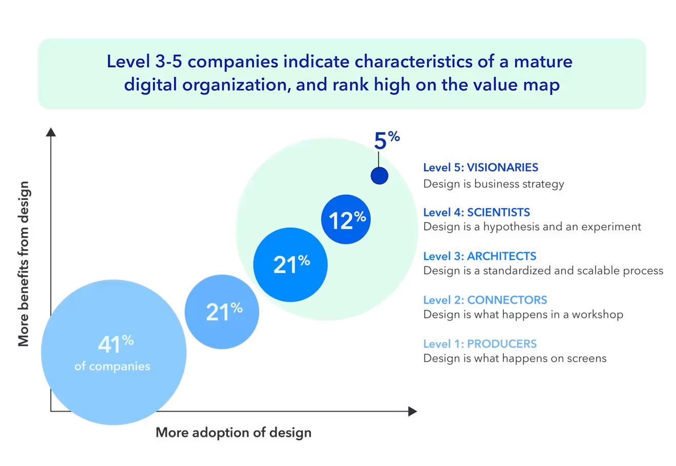
Companies with high design maturity were more likely to see cost savings, revenue gains, productivity gains, speed to market, and brand and market position improvements. Source: Invision, “The New Design Frontier”
Invision recommends that companies at the lower levels “dig in on design systems” and hire people to focus exclusively on creating systems for design at scale. Half of the companies at the highest level of design maturity have dedicated teams to maintain their design system.
McKinsey & Company found a similar correlation between high scores on the McKinsey Design Index and better business outcomes.
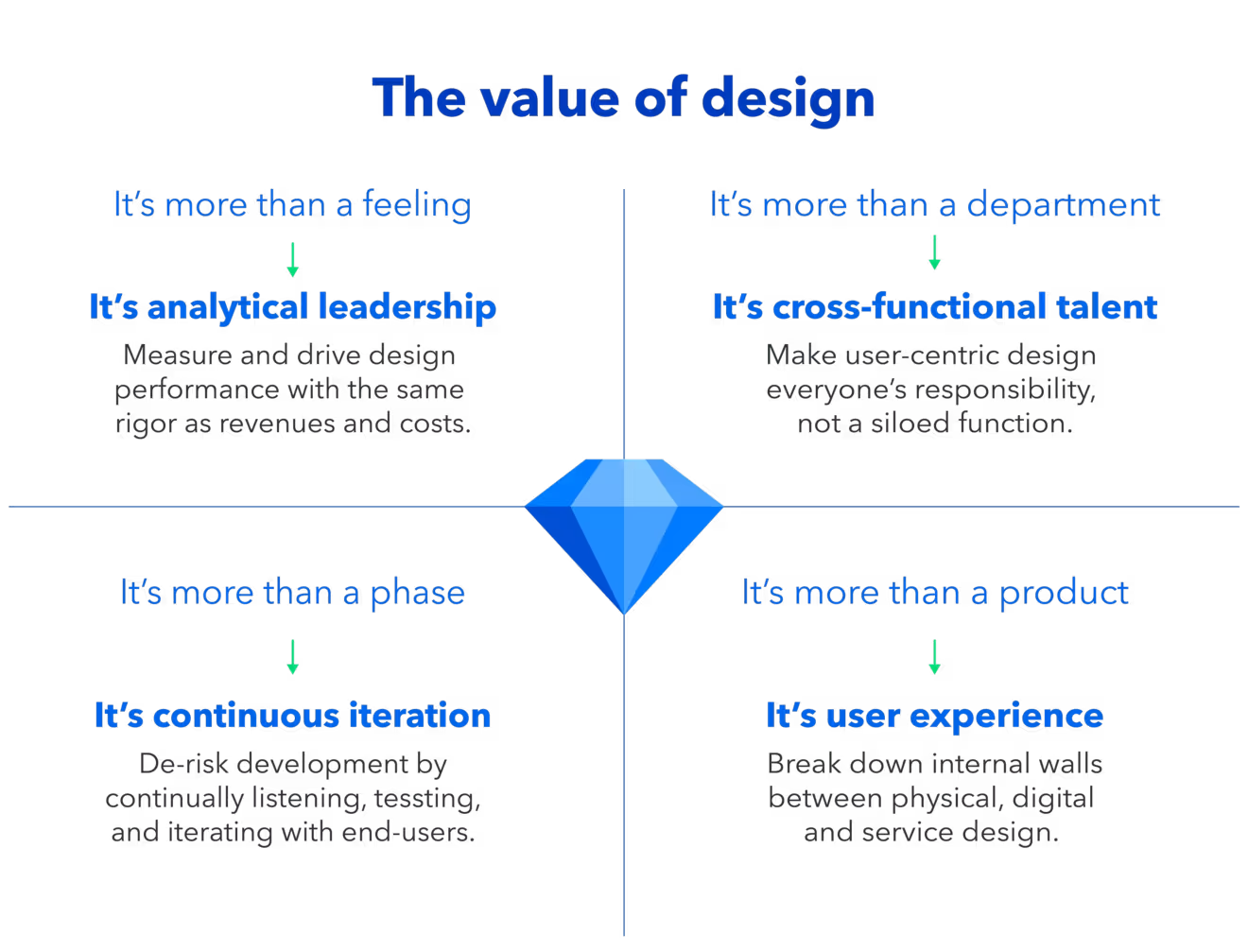
McKinsey & Company found that leading financial performers excelled in all four areas of design. Source: McKinsey & Company, “The Business Value of Design”
Design maturity isn’t the only thing associated with business success. Find out where you rank on the Content Maturity Model and how digital leaders are raising the bar.
What do design systems actually look like?
Every design system is a little bit different. Design systems reflect a company’s personality, values, and brand. They grow and evolve based on business needs, priorities, available resources, and the passions of the designers and engineers who contribute to them.
Below are a few examples of design systems that you can explore. While they all contain brand guidelines, color palettes, reusable components, and pattern libraries, they are as different as the companies they serve. These design systems codify the visual elements that make each company unique and enable users to apply them consistently at scale.
Atlassian’s design system includes brand guidelines, reusable components, and content guidelines. Bold visuals help communicate the design principles they want users to follow.
Communicating design guidelines and best practices is a critical part of a design system. Source: Atlassian
Shopify’s design system, Polaris, is used internally and by Shopify’s merchants. The design system includes access to a Figma UI Kit, release notes on GitHub, and other resources that help teams build products for Shopify.
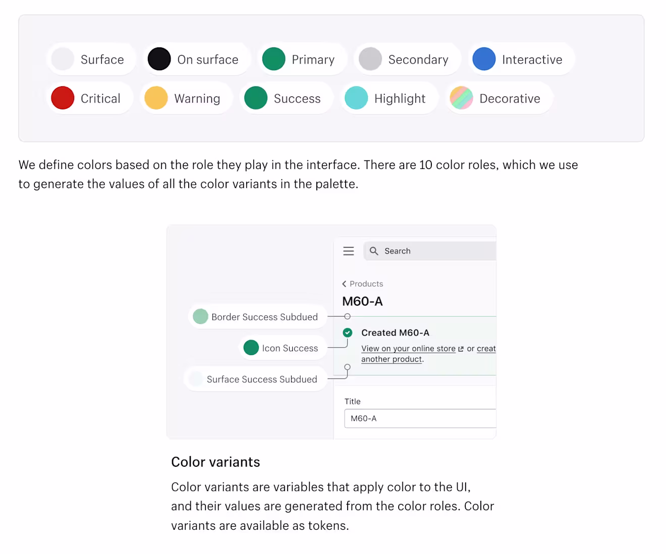
Shopify’s Polaris design system includes granular details like when to use color variants. Source: Shopify
Contentful’s own design system, Forma 36, started as a project in 2018. It’s now an open-source design system with over 47,000 weekly downloads. Reusable components make it easy for developers to create custom apps that fit seamlessly into their Contentful implementation.
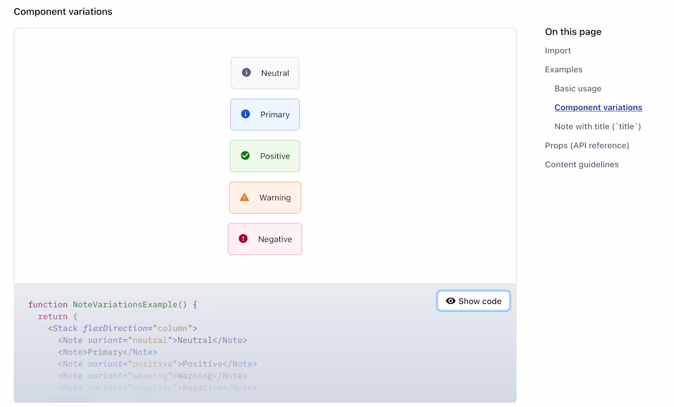
Contentful’s design system provides a shared language, for example, around note components, showing a systemic approach to notifications based on their severity using a consistent color palette. Source: Contentful, Forma 36
Extending the systems approach to content
Design systems are one example of a systems approach that can be applied to many things, including content. In his work on the concept of atomic design, Brad Frost used the analogy of atoms and molecules to illustrate how reusable components provide building blocks that can be assembled into larger assets.
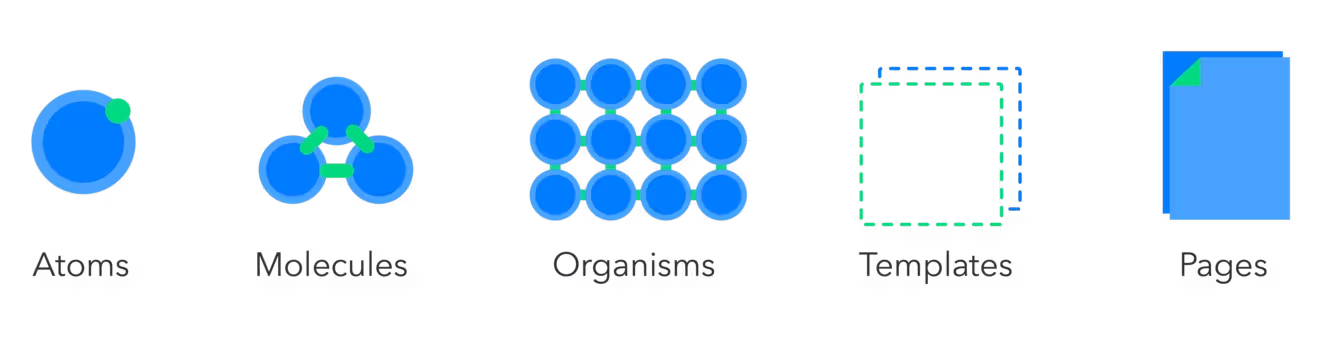
The smallest reusable components are atoms, which can be combined in different ways to form larger components (molecules). By starting with the same atoms and molecules and following clear guidelines to assemble them, we can build things faster and ensure that the end results are consistent.
The same analogy can be applied to content modeling. In atomic content modeling, content is structured into small reusable chunks that builders — developers, product owners, marketers, content creators — assemble into larger digital experiences.
At Contentful, we call this structured content. It’s a key part of what makes the Contentful content platform incredibly flexible and extensible, enabling teams to build and deliver an endless variety of user experiences faster.
Structured content + mature design system = speed
Companies that adopt both structured content and a mature design system can move faster at scale without sacrificing quality or consistency.
When they enter a new market or launch a multi-channel global campaign, they don’t need to start from scratch. They can assemble campaign assets from reusable design and content components. This saves time, increases brand consistency, and enables teams to focus on creating unique experiences instead of just getting the basics right.
Learn how structured content helps editorial teams produce digital experiences faster or schedule a tour to see how Contentful can help your business.

Inspiration for your inbox
Subscribe and stay up-to-date on best practices for delivering modern digital experiences.
Meet the authors

Bulent collaborates with Contentful's customers, partners and users to publish articles that support and elevate the community.
Related articles

The ultimate guide to CSS frameworks in 2025
April 9, 2025

What is vibe coding? Moving fast (and not breaking things) with AI assistance
February 3, 2026

Start a React app with Tailwind CSS in under 5 minutes
October 25, 2024
