How we built Joy 101 with Hoda Kotb: From vision to personalized wellness membership
Published on December 17, 2025

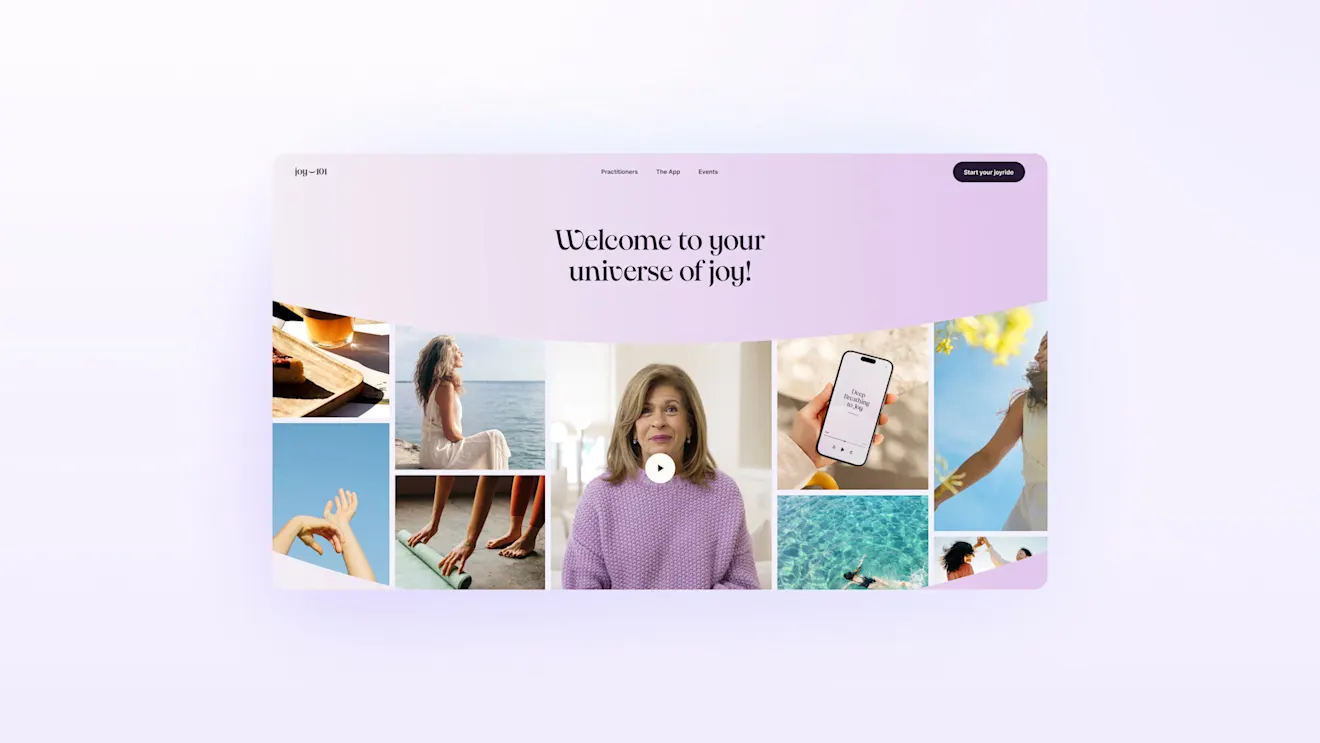
The Joy 101 wellness app began as a simple brief: translate Hoda Kotb’s philosophy — practical, uplifting, and deeply human — into a daily practice people can actually stick with.
As the solution partner behind strategy, UX/UI, and build, the team at Alice aligned on a clear goal: design an experience that feels like a deep breath, not another dopamine loop.
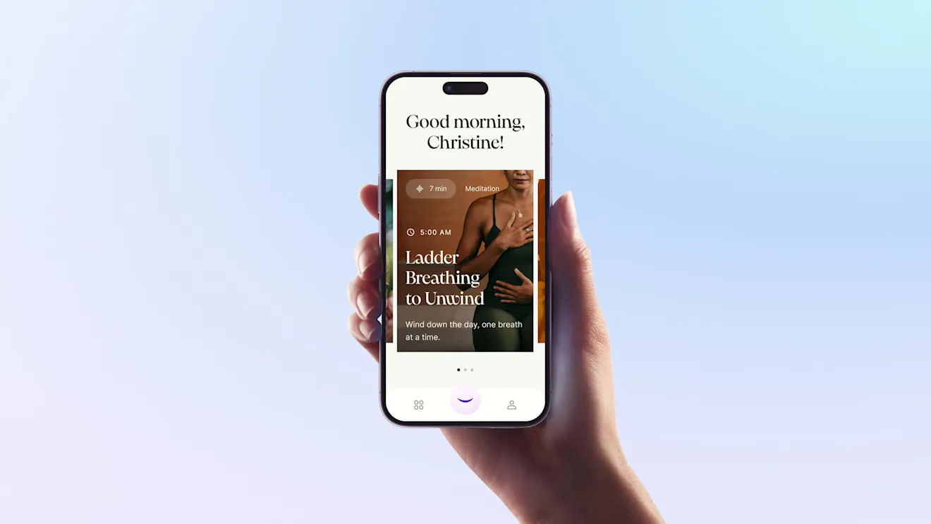
The result is a membership platform and app that delivers short, science-informed practices and personal guidance from Hoda and contributors, wrapped in a warm, intuitive interface and supported by an extensible product architecture.
In this post, we’ll explain how we built it and the composable technologies used, making full use of Contentful Platform and Contentful Personalization.

Why this project mattered
Hoda’s community is both broad and passionate, but their time is limited. We set out to build something that meets people where they are — a few minutes between meetings, a bus ride, or the lull before bedtime — and still helps them make meaningful change. That meant prioritizing intention over infinite scroll, clarity over complexity, and personalization over one-size-fits-all content.
From the start, we framed success around adoption and retention, not vanity metrics. We optimized for first‑week momentum and long‑term habit formation: a calibrated onboarding, personalized recommendations from day one, and a content model that flexes from quick wins to deeper journeys.
What we built
Product foundations
We organized the experience around a small set of repeatable daily practices — breathwork, meditation, movement, journaling, and short reflections — paired with courses and live moments for deeper engagement. The core loop is intentionally lightweight: open the app, see one or two suggestions that fit your energy and time, complete a bite‑sized activity, and feel genuine progress.
This simplicity is supported by a modular architecture: content types share a common schema, which lets us mix modalities in a session, experiment with new formats without code churn, and personalize at the unit level (not just the program level). As the library grows, Joy 101 can recommend the right next nudge — whether that’s a two‑minute reset or a multi‑week pathway.
Content model and curation
Joy 101 mixes Hoda’s voice with a diverse contributor network. To make that scale, we built a content model within the Contentful Platform that:
Separates editorial voice from delivery format, so the same idea can be presented as a short audio, a guided breath sequence, or a journaling prompt.
Stores intent metadata (goal, energy level, estimated time, topic) to power smarter recommendations.
Aligns every piece to an outcome, not just a theme — calm, focus, gratitude, sleep — so users can select for what they need in the moment.
An internal editorial toolkit supports contributor onboarding and quality control, ensuring that what ships is consistent in tone, evidence‑informed, and accessible.
Personalization and experience loops
Leveraging the power of the Contentful ecosystem, we also wanted to make full use of Contentful Personalization.
We designed personalization to feel like care, not surveillance. Onboarding captures preferences and constraints in plain language. Over time, the system adapts to completion patterns and stated goals, gently rotating suggestions to avoid repetition and introducing new modalities when a user is ready.
We then close the loop with reflective prompts and lightweight progress markers. Instead of streaks that punish, Joy 101 celebrates consistency in flexible windows and recognizes returns after time away. The aim is to build a supportive relationship that lasts.

Design system and voice
Joy should feel warm, modern, and uncluttered. The visual language uses generous whitespace, grounded typography, and a color system tuned for calm. Motion cues are subtle and purposeful — progressive disclosure rather than spectacle — to reduce cognitive load.
Accessibility was a non‑negotiable. We designed for readable contrast, clear focus states, screen reader‑friendly structure, and captions/transcripts for all media. Microcopy avoids jargon, offers context at the point of need, and guides without nagging.
Voice and tone were developed with Hoda to preserve her presence without requiring her to be on camera for every interaction. Short scripts, affirmations, and story‑driven intros carry her signature warmth while remaining concise enough for daily use.
Launch strategy and impact
We treated launch as the beginning of a relationship, not the end of a project. The plan combined a tight beta to tune onboarding and recommendations, content drops timed to key moments (morning routines, evening resets), and a runway of live activations to bring the community together.
On day one, we aligned messaging across product, site, and social, and we prepared the infrastructure and analytics for a compressed surge window. Result: a fast, clean install experience, high first‑session completion rates, and strong early engagement signals.
Post‑launch, we shipped weekly improvements based on real behavior — simplifying paths to the top three actions, clarifying program intros, and smoothing the steps from quick practice to deeper course. We also tuned push notifications to emphasize choice and consent, with quiet hours respected by default.
Launch highlights included reaching #1 in Health & Fitness and #4 overall on the Apple App Store, alongside 100k+ Instagram followers on launch day.
What we learned
Short wins lead to deep work. Users who complete a single two‑ to five‑minute practice in their first session are significantly more likely to start a multi‑module course later in week one. Designing for that first micro‑win matters.
Personalization must be transparent. When we explained why a recommendation appeared (“You said evenings are tough” or “You’ve been exploring breathwork”), users engaged more and reported higher satisfaction.
Friction is not the enemy — mystery is. We reduced confusion by trimming choices on entry, adding preview states, and making outcomes explicit. The result: more starts, more finishes, less wandering.
Community multiplies motivation. Lightweight social proof (without public leaderboards) and occasional live moments keep momentum high while preserving a private, personal feel.

Closing thoughts
Projects like Joy 101 work when product vision, editorial craft, and technology pull in the same direction. We are proud of how this collaboration translated a clear point of view into an experience that is personal, practical, and sustainable—without sacrificing delight.
If you’re exploring a membership model or a wellness‑adjacent product, the patterns we used here — modular content, outcome‑based metadata, transparent personalization, and a humane activation strategy — travel well. And both the Contentful Platform and Personalization products are a terrific base to be starting from.
Interested in building something similar? Contact the team at Contentful to explore how solutions partners can help you launch a personalized membership experience.
Inspiration for your inbox
Subscribe and stay up-to-date on best practices for delivering modern digital experiences.


