Built-in styles
Overview
Built-in styles are pre-defined style options that are displayed in the Design sidebar of Experiences. The full list of options can be found below.
Built-in styles list
'cfVisibility',
'cfHorizontalAlignment',
'cfVerticalAlignment',
'cfMargin',
'cfPadding',
'cfBackgroundColor',
'cfWidth',
'cfMaxWidth',
'cfHeight',
'cfImageAsset',
'cfImageOptions',
'cfBackgroundImageUrl',
'cfBackgroundImageOptions',
'cfFlexDirection',
'cfFlexWrap',
'cfFlexReverse',
'cfBorder',
'cfBorderRadius',
'cfGap',
'cfFontSize',
'cfFontWeight',
'cfLineHeight',
'cfLetterSpacing',
'cfTextColor',
'cfTextAlign',
'cfTextTransform',
'cfTextBold',
'cfTextItalic',
'cfTextUnderline',
'cfBackgroundImageScaling',
'cfBackgroundImageAlignment',
'cfBackgroundImageAlignmentVertical',
'cfBackgroundImageAlignmentHorizontal',
To stay up to date on the latest set of Built-in styles check CF_STYLE_ATTRIBUTES in the constants file in the Studio Core package source code.
Enable built-in styles
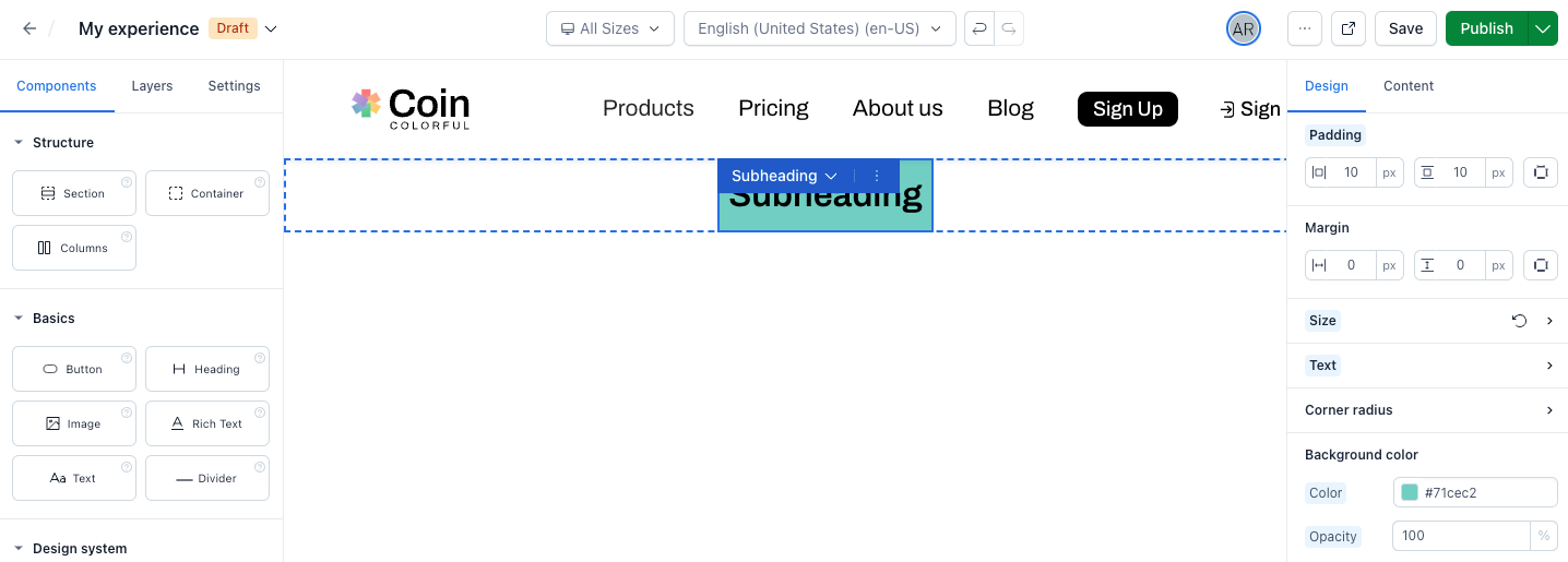
To enable built-in styles, first define and register a custom component and then add the builtInStyles property to the component definition like below.
import type { ComponentDefinition } from '@contentful/experiences-sdk-react'

export const subheadingComponentDefinition: ComponentDefinition = {
  id: 'subheading',
  name: 'Subheading',
  category: 'Atoms',
  builtInStyles: ['cfMargin', 'cfPadding', 'cfBackgroundColor'],
  variables: {
    text: {
      displayName: 'Text',
      type: 'Text',
      defaultValue: 'Subheading',
    },
    variant: {
      displayName: 'Variant',
      type: 'Text',
      defaultValue: 'dark',
      group: 'style',
      validations: {
        in: [{ value: 'light' }, { value: 'dark' }]
      }
    }
  }
}
In the example above, by including the builtInStyles property in the definition we enable the following built-in styles:
- Margin
- Padding
- Background
These built-in styles are displayed as options in the Design tab for the "Subheading" custom component.
- Margin widget is by default enabled for all components. You can set
builtInStyles = []to disable it. - The component needs to accept
classNameproperty for this feature to work. Otherwise, the “Design” tab changes don't affect the component.
Modifying the default value for built-in styles
Default values can be specified when using built-in styles in the component definition.
To use a built-in style with a custom default value:
- Remove the built-in style's prop name from the
builtInStylesarray (otherwise the custom default value is ignored). - Add the built-in style to the
variablesobject as a key-value pair, where key is the style prop name and value is the full variable definition which includes your newdefaultValue. The following example demonstrates a component definition that uses the built-in styles for margin and padding. The margin widget will be enabled with the standard default value, while the padding widget is enabled with a custom default value of'0 10px 0 10px':
import type { ComponentDefinition } from '@contentful/experiences-sdk-react';

const exampleComponentDefinition: ComponentDefinition = {
  id: 'example',
  name: 'Example',

  // Enable the margin widget with its standard default value
  builtInStyles: ['cfMargin'],

  // Enable the padding widget with a custom default value
  variables: {
    cfPadding: {
      displayName: 'Padding',
      type: 'Text',
      group: 'style',
      defaultValue: '0 10px 0 10px'
    }
  }
};