Layout structures
Parent-child relationship
In Experiences, every element, structural or basic, has a parent-child relationship in a tree-like structure. At the top of every experience is the root, represented by a blank canvas in the Experiences UI. From there, you can start adding structural or basic elements onto the canvas, which become the direct children of the root. There are no limits or restrictions on how deep the tree can go, which means there’s no limit to the complexity you can achieve to accomplish the necessary goals for customers.
Structure components
Structure components act as foundational building blocks for defining layouts, serving as the skeleton of an experience. Additionally, they function as content wrappers, allowing you to control the layout orientation and direction of their contained elements.
Structural components include the following:
- Sections - Serve as a simple building block when defining the layout of an experience. They take up 100% of the available width provided by the parent and allow any basic or structural element to be placed inside them. They act like full-width containers, providing an alternative way to organize content.
- Containers - Serve as another simple building block when defining the layout of an experience. They have a fixed max-width of 1192px, with margins set to
auto, and shrink to fit within the parent if the parent has a smaller width. Additionally, they allow any basic or structural element to be placed inside them. - Columns - Allow you to create column-based layouts on a 12-column grid, which is useful for more complex layouts with multiple columns of content. Each child of a columns component can be assigned a specific number of columns, allowing you to control the width of each child relative to the total width of the columns component.
Using sections, containers, and columns
Use sections and containers for flexible layouts that group elements and control layout direction. Columns are ideal for structured, side-by-side layouts with consistent formatting. Additionally, all structural components can contain any other component, structural or basic, allowing complete freedom to customize your layouts.
Basic components
Basic components provide a way for users to get started with some commonly-used elements. Once the basic structure of the experience has been laid out, it’s time to place components onto the canvas to bring the experience to life. You can replace out-of-the-box basic components (button, for example) with your own custom components. To learn how to set up custom components, see Register custom components.
Controlling layout in components with children
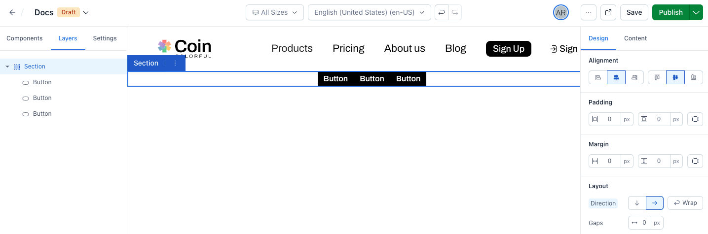
When you add children to a component in Experiences, the children are automatically wrapped in a <div> element within the Experiences canvas. This can sometimes unexpectedly break layouts, especially if you’re trying to create a layout with multiple children in a row or column.
To work around this issue, you can use a container or section component to wrap your children. This allows you to control the layout of the children and apply common styles to them.
For example, if you want to create a horizontal layout, you can place a section as the top-level child, set its layout direction to ‘row’, and then nest the components you want to layout horizontally within that section. This approach allows you to make style adjustments on the nested structure component, thereby controlling the layout direction and other styles. These adjustments can be made in the Design sidebar.
For advanced use cases, you can write CSS to target the .contentful-container class to overwrite styles for sections and containers. This gives you more control over the appearance of your components and allows you to create more complex layouts.
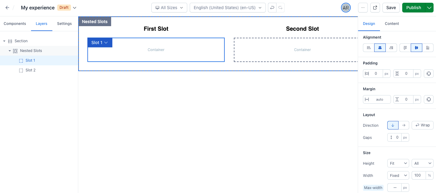
Complex components with multiple slots for nesting children
Starting from @contentful/experiences-sdk-react v1.6.0, custom components can be enhanced with multiple slots for nesting children components. This enhancement provides developers with greater flexibility in creating complex structures within their custom components, if desired.
To utilize multiple slots, define a slots configuration in the component definition. Each slot requires a unique key and a display name.
In your custom component, manage the props for each slot. Use the key of each slot definition object as the prop variable name:
Upon adding the custom component to an experience, each slot automatically receives a container component. The container’s display name matches the slot’s configured display name. This slot container aids in layout management, facilitating the positioning and orientation of nested child components.