Was this page helpful?

Implementing nested components with custom components

Overview

Complex user experiences often require nested components such as carousels, tabs, or accordions. These components typically consist of a wrapper component that accepts arbitrary children and decides where and how to render them, along with item components that provide the content for each slot.

This guide demonstrates how to implement these nested component patterns using Contentful Studio custom components via children: true, enabling editors to create rich, interactive experiences while maintaining full control over the component structure and facilitating full editability in Studio.

Table of contents

Architecture overview

The solution follows a parent-child component pattern where:

  • Parent components (Carousel, Tabs) accept children and control the overall structure
  • Child components (CarouselSlide, TabsItem) provide content for each slot
  • Communication happens through React's children API and component props
  • Editor experience is optimized using the built-in interactive vs. design mode toggles

Key components

  • Wrapper components with children: true that accept arbitrary child components
  • Item components that provide content and metadata for each slot
  • Interactive controls for editors to switch between design and preview
  • Type-safe communication between parent and child components

Data flow

  1. Editor experience:
    1. Editor adds parent component (e.g., Carousel)
    2. Editor adds child components (e.g., CarouselSlide) inside the parent
    3. Parent component reads child properties and renders accordingly
  2. End-user experience:
    1. Components render with full interactivity
    2. User can interact with carousels, tabs, etc.
    3. Content updates dynamically based on user interactions

Prerequisites

Before starting this exemplary implementation, ensure you have…

  • A Next.js project with App Router
  • Contentful Experiences SDK installed (@contentful/experiences-sdk-react)
  • A UI library like Ant Design for complex components
  • Basic understanding of React children patterns
  • TypeScript for type safety

The underlying concept and implementation solution will work with any tech stack, so this stack is just exemplary for demonstration purposes.

Setting up the project structure

The example implementation follows this directory structure…
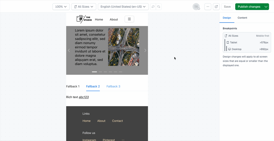
src/
├── components/
│   ├── CarouselComponentRegistration.tsx
│   ├── CarouselSlideComponentRegistration.tsx
│   ├── TabsComponentRegistration.tsx
│   ├── types.ts
│   └── *.module.css
├── utils/
│   ├── types.ts
│   └── store.ts
└── studio-config.ts

The carousel implementation consists of two components: a CarouselComponent that wraps the carousel functionality and a CarouselSlideComponent that represents individual slides.

The carousel component accepts children and provides carousel functionality with autoplay support. The editor experience also is tailored to prevent the carousel from sliding when editing content in edit mode while keeping it interactive both in interactive mode as well as end-users.

// src/components/CarouselComponentRegistration.tsx
import React from 'react';
import { ComponentRegistration } from '@contentful/experiences-sdk-react';
import clsx from 'clsx';
import { CustomComponentProps } from './types';
import { Carousel } from 'antd';

import styles from './CarouselComponentRegistration.module.css';

type CarouselComponentProps = CustomComponentProps<{
  children: React.ReactNode;
  autoplay: string;
}>;

export const CarouselComponentRegistration: ComponentRegistration = {
  component: ({
    className,
    children,
    autoplay,
    isEditorMode,
    // https://www.contentful.com/developers/docs/experiences/custom-components/#component-requirements
    ...rest
  }: CarouselComponentProps) => {
    return (
      <div className={clsx(className, styles.carousel)} {...rest}>
        <Carousel
          autoplay={Boolean(autoplay && !isEditorMode)}
          autoplaySpeed={Number(autoplay)}
          arrows
        >
          {children}
        </Carousel>
      </div>
    );
  },
  options: {
    enableEditorProperties: {
      isEditorMode: true,
    },
    wrapComponent: false,
  },
  definition: {
    id: 'custom-carousel',
    name: 'Carousel',
    category: 'Structure',
    children: true,
    variables: {
      autoplay: {
        displayName: 'Autoplay Delay',
        type: 'Number',
        group: 'content',
      },
    },
  },
};

The carousel slide component represents individual slides within the carousel.

// src/components/CarouselSlideComponentRegistration.tsx
import React from 'react';
import { ComponentRegistration } from '@contentful/experiences-sdk-react';
import clsx from 'clsx';
import { CustomComponentProps } from './types';

import styles from './CarouselSlideComponentRegistration.module.css';

type CarouselSlideComponentProps = CustomComponentProps<{
  children: React.ReactNode;
  title: string;
}>;

export const CarouselSlideComponentRegistration: ComponentRegistration = {
  component: ({
    className,
    children,
    title,
    // https://www.contentful.com/developers/docs/experiences/custom-components/#component-requirements
    ...rest
  }: CarouselSlideComponentProps) => {
    return (
      <div
        className={clsx(className, styles.carouselSlide)}
        title={title}
        {...rest}
      >
        {children}
      </div>
    );
  },
  options: {
    wrapComponent: false,
  },
  definition: {
    id: 'custom-carousel-slide',
    name: 'Carousel Slide',
    category: 'Structure',
    children: true,
    variables: {
      title: {
        displayName: 'Title',
        type: 'Text',
        group: 'content',
      },
    },
  },
};

Creating the tabs components

The tabs implementation demonstrates more complex parent-child communication, where the parent component needs to extract information from its children to build the tab navigation.

Utility Types and Functions

Be aware that interacting with the entity store like shown in the following exemplary implementation is a NOT OFFICIALLY SUPPORTED strategy.

We’re exploring having a standalone SDK method for this in a future version, so use/adapt the subsequent example implementation at your own risk.

First, we need utility functions to handle bound and unbound values from the Experiences SDK:

// src/utils/types.ts
import { type EntityStore } from '@contentful/experiences-core';
import {
  BoundValue,
  ComponentTreeNode,
  UnboundValue,
} from '@contentful/experiences-validators';
import { isValidElement, ReactElement } from 'react';

export type ValueOfRecord<R> = R extends Record<string, infer T> ? T : never;

export type Variable = ValueOfRecord<ComponentTreeNode['variables']>;

export type CompositionNode = {
  node: ComponentTreeNode;
  locale: string;
  entityStore: EntityStore;
  wrappingPatternIds: never;
  wrappingParameters: never;
  patternRootNodeIdsChain: string;
};

export const isValidCompositionNode = (
  element: unknown
): element is ReactElement<CompositionNode> => {
  return Boolean(
    isValidElement(element) &&
      element.props &&
      typeof element.props === 'object' &&
      'node' in element.props
  );
};

export const isUnboundValue = (
  variable: Variable
): variable is UnboundValue => {
  return variable.type === 'UnboundValue';
};

export const isBoundValue = (variable: Variable): variable is BoundValue => {
  return variable.type === 'BoundValue';
};
// src/utils/store.ts
import { type EntityStore } from '@contentful/experiences-core';
import { UnresolvedLink } from 'contentful';

export const resolveUnboundValue = (
  entityStore: EntityStore,
  mappingKey: string,
  defaultValue: string
) => {
  return entityStore.unboundValues[mappingKey]?.value ?? defaultValue;
};

export const resolveBoundValue = (
  entityStore: EntityStore,
  path: string,
  defaultValue: string
) => {
  const [, uuid, , field] = path.split('/');
  const boundEntityLink = entityStore.dataSource[uuid] as UnresolvedLink<
    'Entry' | 'Asset'
  >;
  const resolvedEntity = entityStore.getEntryById(boundEntityLink.sys.id);
  return resolvedEntity?.fields[field] ?? defaultValue;
};

Tabs Component

The tabs component processes its children to extract tab labels (= the label attribute of the child custom component) and creates the tab navigation:

// src/components/TabsComponentRegistration.tsx
import React, { ReactElement } from 'react';
import { ComponentRegistration } from '@contentful/experiences-sdk-react';
import clsx from 'clsx';
import { CustomComponentProps } from './types';
import { Tabs } from 'antd';
import {
  CompositionNode,
  isBoundValue,
  isUnboundValue,
  isValidCompositionNode,
} from '@/utils/types';
import { resolveBoundValue, resolveUnboundValue } from '@/utils/store';

import styles from './TabsComponentRegistration.module.css';

type TabsComponentProps = CustomComponentProps<{
  children: React.ReactNode;
  active: number;
}>;

type TabsItemComponentProps = CustomComponentProps<{
  children: React.ReactNode;
  label: string;
}>;

const isValidTabItem = (
  element: unknown
): element is ReactElement<CompositionNode> => {
  return (
    isValidCompositionNode(element) &&
    element.props.node.definitionId === 'custom-tabs-item'
  );
};

export const TabsComponentRegistration: ComponentRegistration = {
  component: ({
    className,
    children,
    active,
    // https://www.contentful.com/developers/docs/experiences/custom-components/#component-requirements
    ...rest
  }: TabsComponentProps) => {
    const items = React.Children.map(children, (child, index) => {
      const fallbackLabel = `Fallback ${index + 1}`;
      const fallbackKey = `tab-fallback-${index + 1}`;

      if (isValidTabItem(child)) {
        return {
          label: String(
            isUnboundValue(child.props.node.variables.label)
              ? resolveUnboundValue(
                  child.props.entityStore,
                  child.props.node.variables.label.key,
                  fallbackLabel
                )
              : isBoundValue(child.props.node.variables.label)
              ? resolveBoundValue(
                  child.props.entityStore,
                  child.props.node.variables.label.path,
                  fallbackLabel
                )
              : fallbackLabel
          ),
          key: child.props.node.id ?? fallbackKey,
          children: child,
        };
      }

      return {
        label: fallbackLabel,
        key: fallbackKey,
        children: child,
      };
    });

    return (
      <div className={clsx(className, styles.tabs)} {...rest}>
        <Tabs items={items ?? []} defaultActiveKey={items?.[active - 1]?.key} />
      </div>
    );
  },
  options: {
    wrapComponent: false,
  },
  definition: {
    id: 'custom-tabs',
    name: 'Tabs',
    category: 'Structure',
    children: true,
    variables: {
      active: {
        displayName: 'Active',
        type: 'Number',
        group: 'content',
      },
    },
  },
};

export const TabsItemComponentRegistration: ComponentRegistration = {
  component: ({
    className,
    children,
    // https://www.contentful.com/developers/docs/experiences/custom-components/#component-requirements
    ...rest
  }: TabsItemComponentProps) => {
    return (
      <div className={clsx(className, styles.tabsItem)} {...rest}>
        {children}
      </div>
    );
  },
  options: {
    wrapComponent: false,
  },
  definition: {
    id: 'custom-tabs-item',
    name: 'Tabs Item',
    category: 'Structure',
    children: true,
    variables: {
      label: {
        displayName: 'Label',
        type: 'Text',
        group: 'content',
      },
    },
  },
};

Handling editor mode

One of the key considerations for nested components is handling the difference between editor and end-user experiences. Interactive components like carousels should behave differently in editor mode to prevent interference with the editing process.

Interactive vs. Design Mode

The carousel component demonstrates this by disabling autoplay when in editor mode:

<Carousel
  autoplay={Boolean(autoplay && !isEditorMode)}
  autoplaySpeed={Number(autoplay)}
  arrows
>
  {children}
</Carousel>

This approach allows editors to:

  • Switch between interactive mode and design mode
  • Preview the component behavior without interference
  • Edit content without components auto-advancing
  • Test the full user experience when needed

Interactive mode vs. design mode toggle

Registering custom components

Register all your custom components with the Experiences SDK:

// src/studio-config.ts
import { defineComponents } from '@contentful/experiences-sdk-react';
import { CarouselComponentRegistration } from './components/CarouselComponentRegistration';
import { CarouselSlideComponentRegistration } from './components/CarouselSlideComponentRegistration';
import {
  TabsComponentRegistration,
  TabsItemComponentRegistration,
} from './components/TabsComponentRegistration';

defineComponents([
  CarouselComponentRegistration,
  CarouselSlideComponentRegistration,
  TabsComponentRegistration,
  TabsItemComponentRegistration,
]);

Best practices

Component Design

  • Keep components focused: Each component should have a single responsibility
  • Use consistent naming: Follow a clear naming convention for parent-child relationships
  • Provide fallbacks: Always provide fallback values for missing data
  • Handle edge cases: Consider what happens with empty or invalid children

Editor Experience

  • Disable interactivity in editor mode: Prevent auto-advancing carousels, auto-opening accordions, etc.
  • Provide visual feedback: Show component boundaries and relationships clearly
  • Support design mode: Allow editors to preview specific states (e.g., specific tab, specific slide)
  • Maintain parity: Keep editor experience close to end-user experience

Performance Considerations

  • Lazy loading: Consider lazy loading for complex nested components
  • Memoization: Use React.memo for expensive child components
  • Efficient re-renders: Minimize unnecessary re-renders in parent components

Type Safety

  • Strong typing: Use TypeScript for all component props and children
  • Runtime validation: Validate component structure at runtime
  • Error boundaries: Implement error boundaries for graceful failure handling

Conclusion

This implementation provides a robust foundation for creating complex nested components in Contentful Studio. The parent-child pattern enables rich, interactive experiences while maintaining editor-friendly workflows. The modular architecture makes it easy to extend and adapt for different use cases.

Key benefits of this approach

  • Flexibility: Support for arbitrary nesting and content
  • Editor experience: Intuitive editing with visual feedback
  • Type safety: Full TypeScript support for component communication
  • Performance: Optimized rendering and interaction handling
  • Maintainability: Clear separation of concerns and reusable patterns

For more advanced use cases, consider implementing additional features like:

  • Dynamic content: Support for content that changes based on user interactions
  • State management: Complex state handling for multi-step components
  • Accessibility: Enhanced accessibility features for screen readers
  • Analytics: Tracking component usage and user interactions