Register custom breakpoints
Overview
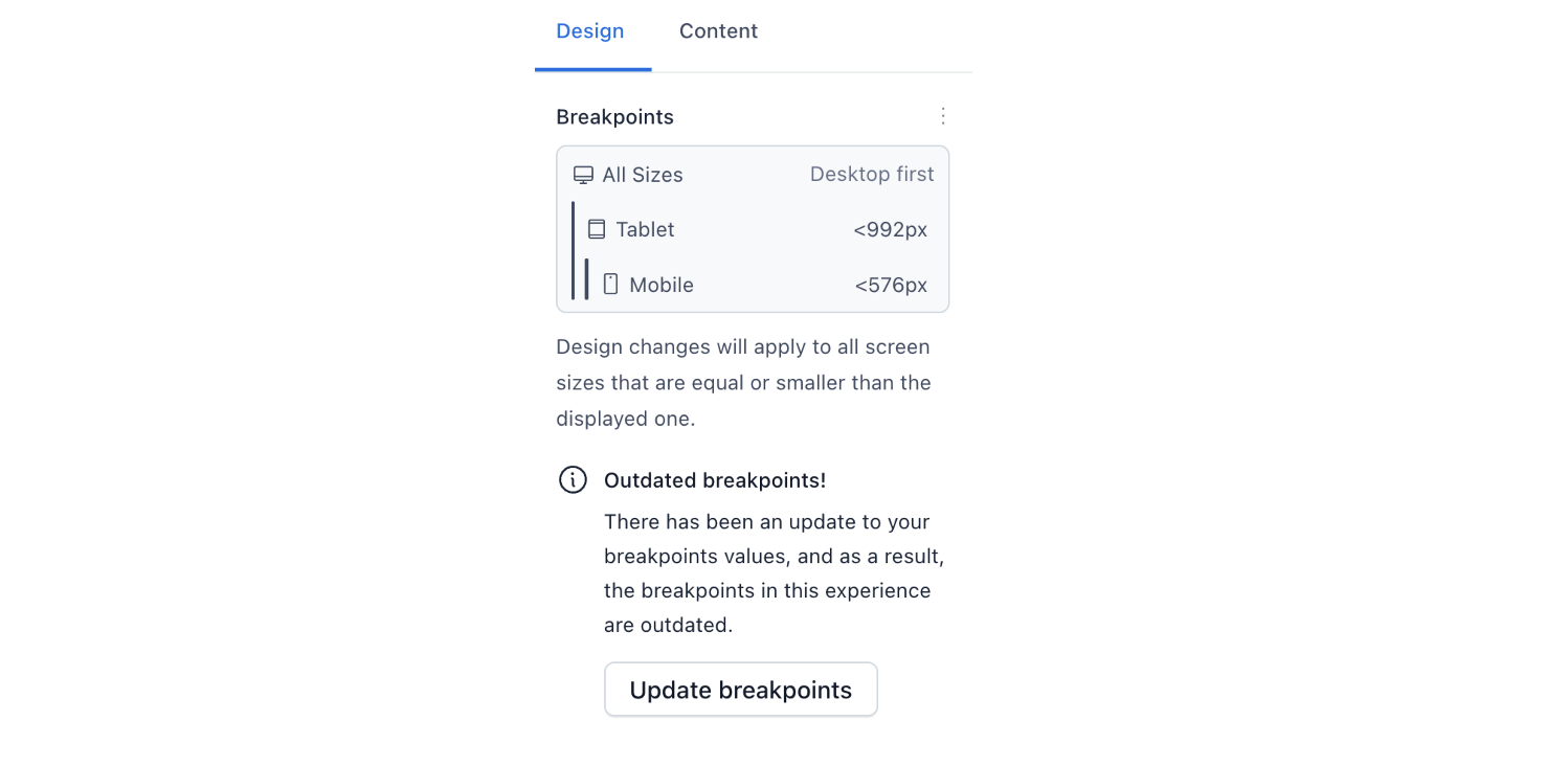
When working in an experience, you can change your design based on your user's screen width. With breakpoints, we define at what screen width a user sees a different design. In Experiences, there are the following default breakpoints:
| Breakpoint name | Screen width |
|---|---|
All Sizes |
Any |
Tablet |
Less than 992px |
Mobile |
Less than 576px |
However, if the default breakpoints do not cover your needs, you can register custom breakpoints.
Create custom breakpoints
Breakpoint object
A breakpoint definition consists of the following properties:
| Property | Value type | Description | Required |
|---|---|---|---|
id |
String | Must be a unique value. | Yes |
query |
String | Defines the range of viewport sizes that are targeted by this breakpoint using either < or >. The first breakpoint must have a wild card query. |
Yes |
previewSize |
String | Defines the size of the canvas in the experience editor to test the view for this breakpoint. Make sure that this value is covered by the query. |
Yes |
displayName |
String | Is displayed as a breakpoint label in the experience editor. | Yes |
displayIcon |
String | Possible values: desktop, tablet, mobile. We plan to support more breakpoint display icons in the future. |
No |
Update an experience with a custom breakpoint
To add a custom breakpoint and update your experience to it:
- Register a custom breakpoint.
To set up custom breakpoints, use the defineBreakpoints function and provide an array of breakpoint objects. The first breakpoint covers all sizes and must include a wildcard query (*). Breakpoints must follow either a desktop-first or mobile-first strategy, so list them either from largest to smallest pixel value or vice versa.
Example using a desktop-first strategy
import { defineBreakpoints } from '@contentful/experiences-sdk-react';

defineBreakpoints([
  {
    id: 'desktop',
    query: '*',
    displayName: 'All Sizes',
    displayIcon: 'desktop',
    previewSize: '100%',
  },
  {
    id: 'tablet',
    query: '<992px',
    displayName: 'Tablet',
    displayIcon: 'tablet',
    previewSize: '820px',
  },
  {
    id: 'mobile',
    query: '<576px',
    displayName: 'Mobile',
    displayIcon: 'mobile',
    previewSize: '390px',
  },
])
Example using a mobile-first strategy
import { defineBreakpoints } from '@contentful/experiences-sdk-react';

defineBreakpoints([
  {
    id: 'mobile',
    query: '*',
    displayName: 'All Sizes',
    displayIcon: 'mobile',
    previewSize: '390px',
  },
  {
    id: 'tablet',
    query: '>576px',
    displayName: 'Tablet',
    displayIcon: 'tablet',
    previewSize: '820px',
  },
  {
    id: 'desktop',
    query: '>992px',
    displayName: 'Desktop',
    displayIcon: 'desktop',
    previewSize: '100%',
  },
])- For an existing experience: update your experience with a custom breakpoint. To apply the custom breakpoint to your existing experience, de-select all the components in the canvas, then go to the Design tab of the right sidebar and click Update breakpoints.